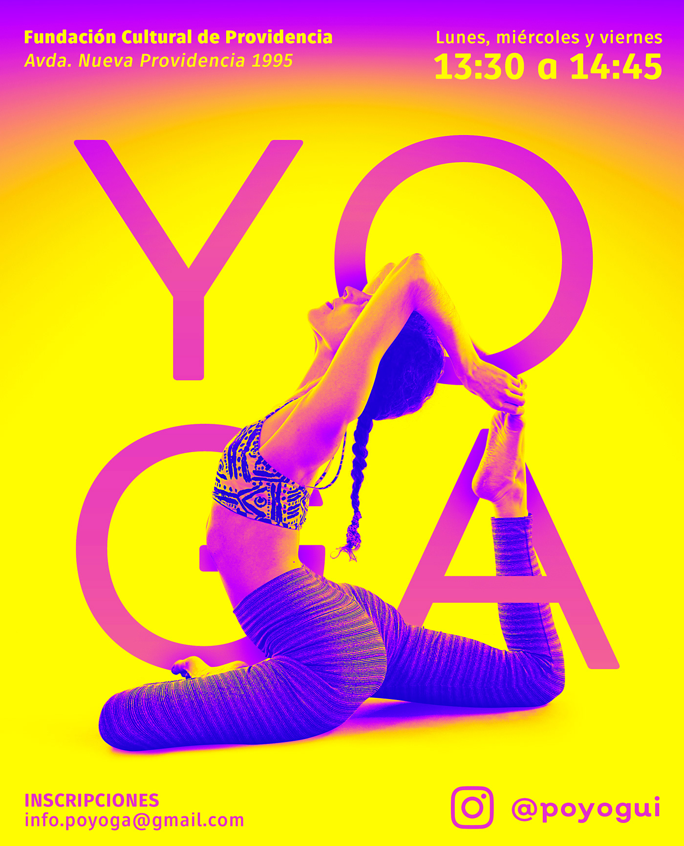
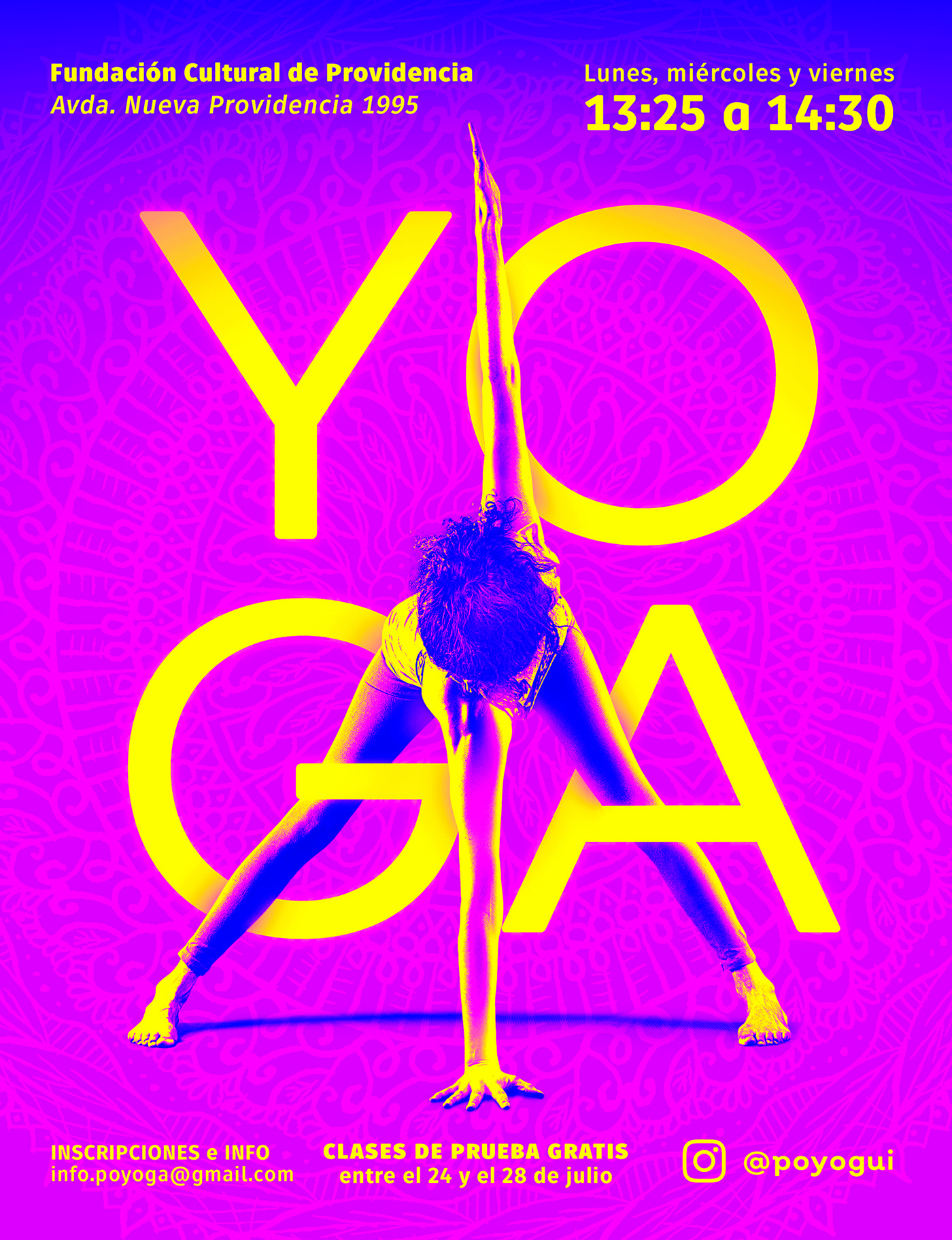
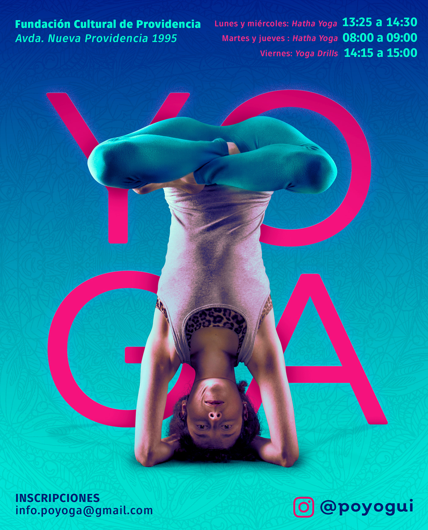
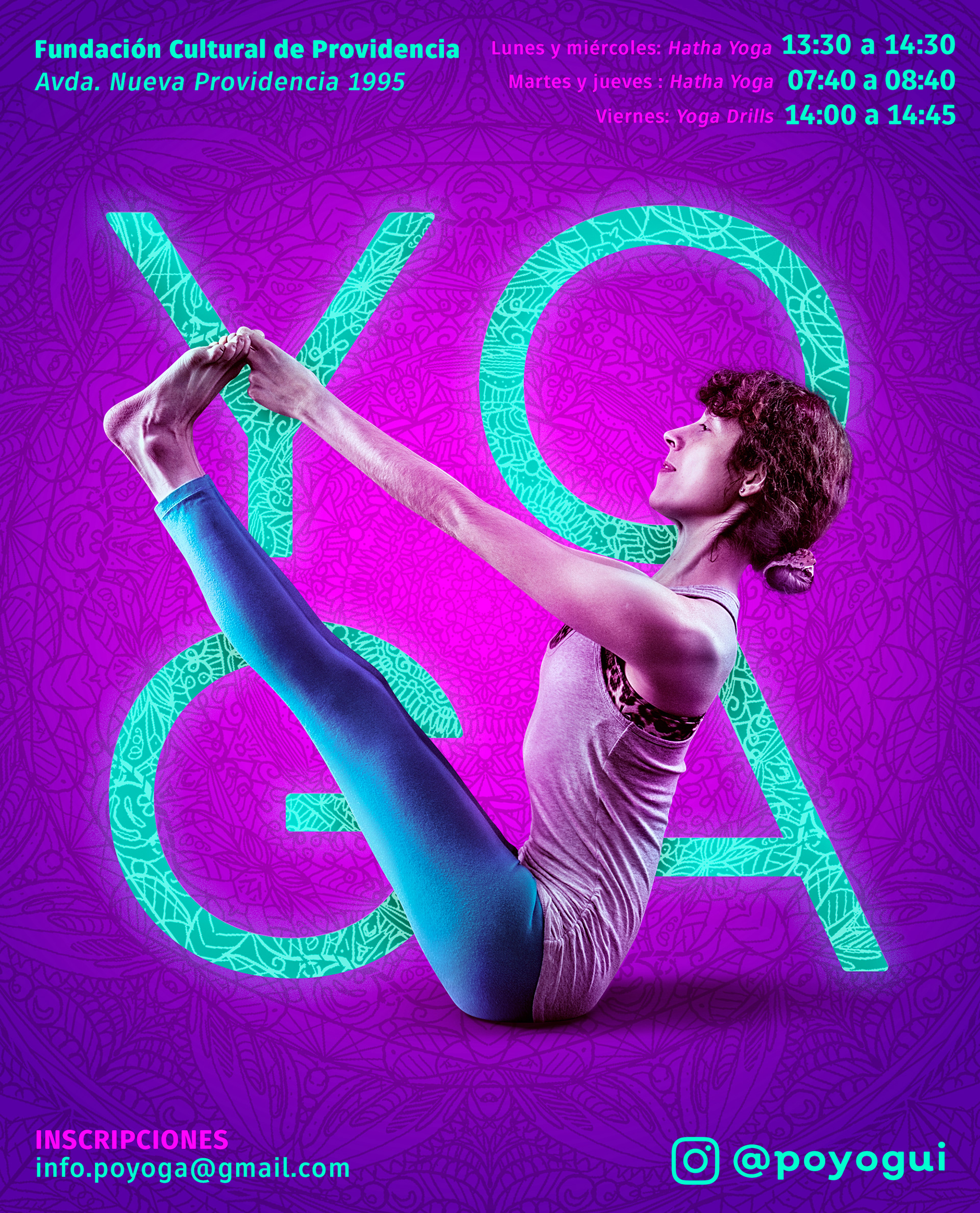
This is an ongoing personal branding project for Yoga Instructor Roxanna.
She is known as Pollo 🐤 (chicken) by her friends and family, so we named her brand Poyoga: Pollo + Yoga.


We designed the posters to be different to everything you expect about yoga: typically soft colors, clean backgrounds, lots of script fonts, etc.
We wanted bright, fun colors. Cool photo treatments. Nice, modern typography. A completely different approach.


We designed her cards with a full body front and back photo of Roxanna, that folds in half to represent a yoga sequence from a sun salutation.
This simple but elegant designed was very welcomed by one of my absolute idols in design: Stefan Sagmeister from Sagmeister & Walsh. Even Jessica Walsh gave it a like :)
It's been a pleasure working with such a talented yogui, and the process though atypical, is a breath of fresh air and gives space to creativity and proposing as we advance in her personal branding.
There's still a lot to be done, and I'll be posting the progress here, so be sure to appreciate this project and also follow Poyoga in her social media:
NAMASTÉ 🙌
