
— Phase 00: The Brief
1. Highlight the message of the OPPO & PUBG cooperation
2. Create a connection between the product and the popular video game.
— Phase 01: Sketches
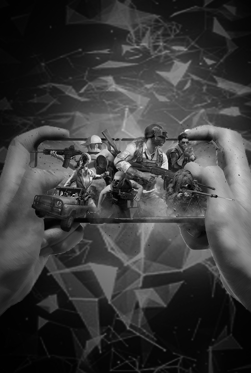
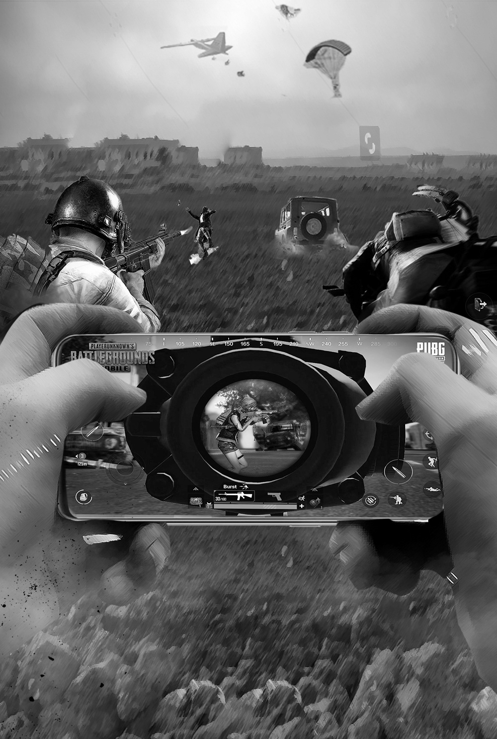
We created a series of black and white sketches to help establish the core visual concept. Starting the iteration process from a solid piece of imagery would prove the most efficient way to translate our thoughts between our team and our clients in China.
— Phase 02: Production
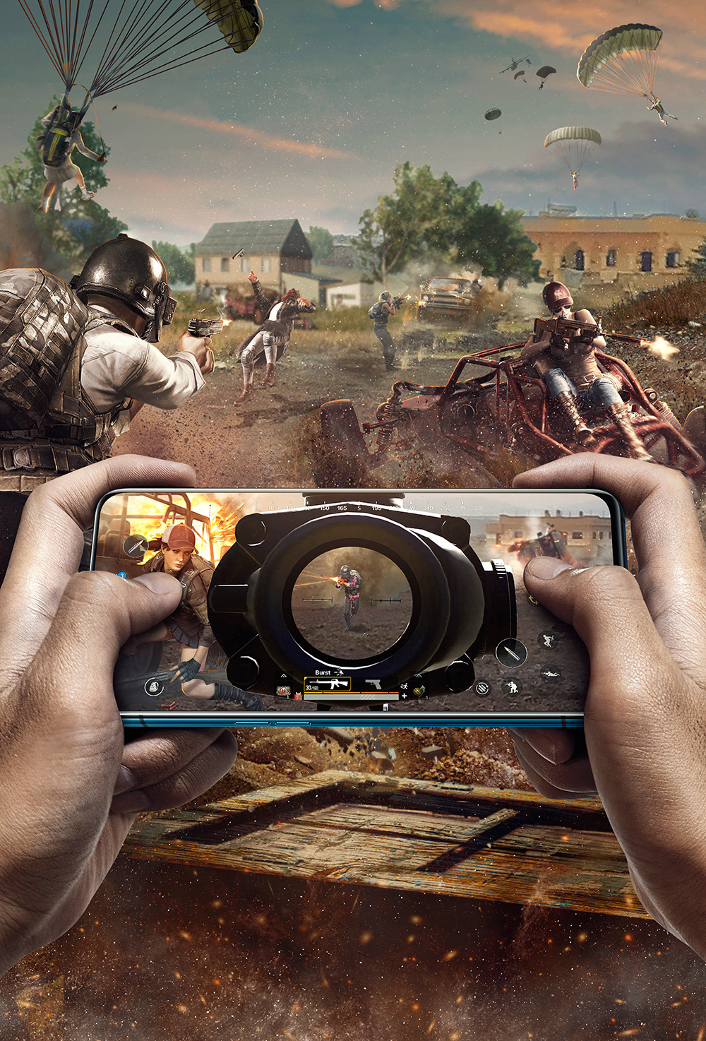
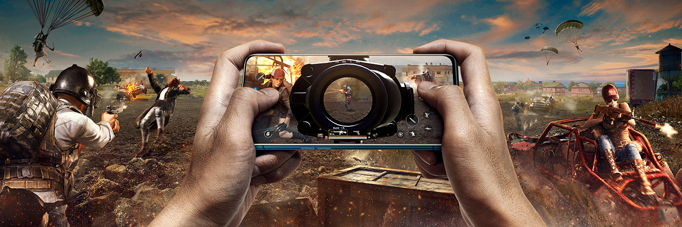
With two images selected by the client, we started the production phase. Replacing the sketch-quality images for high-resolution assets, equalizing the light, color, and saturation values of each official PUBG asset so they could be photo-composited into one massive, single, cohesive image that would work flawlessly in both vertical and horizontal formats.
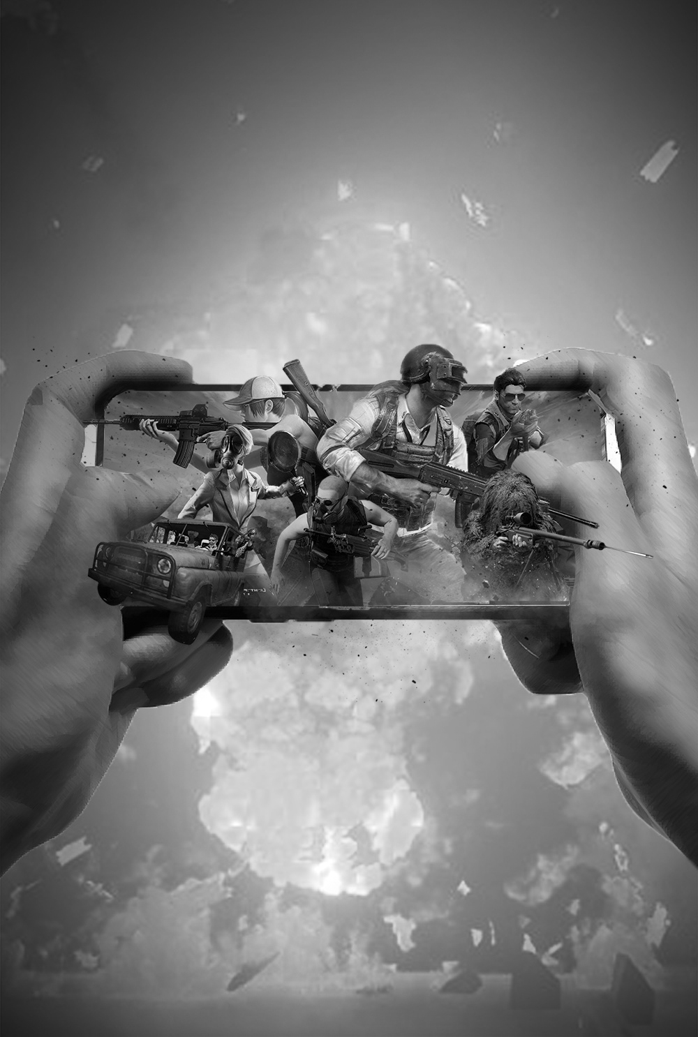
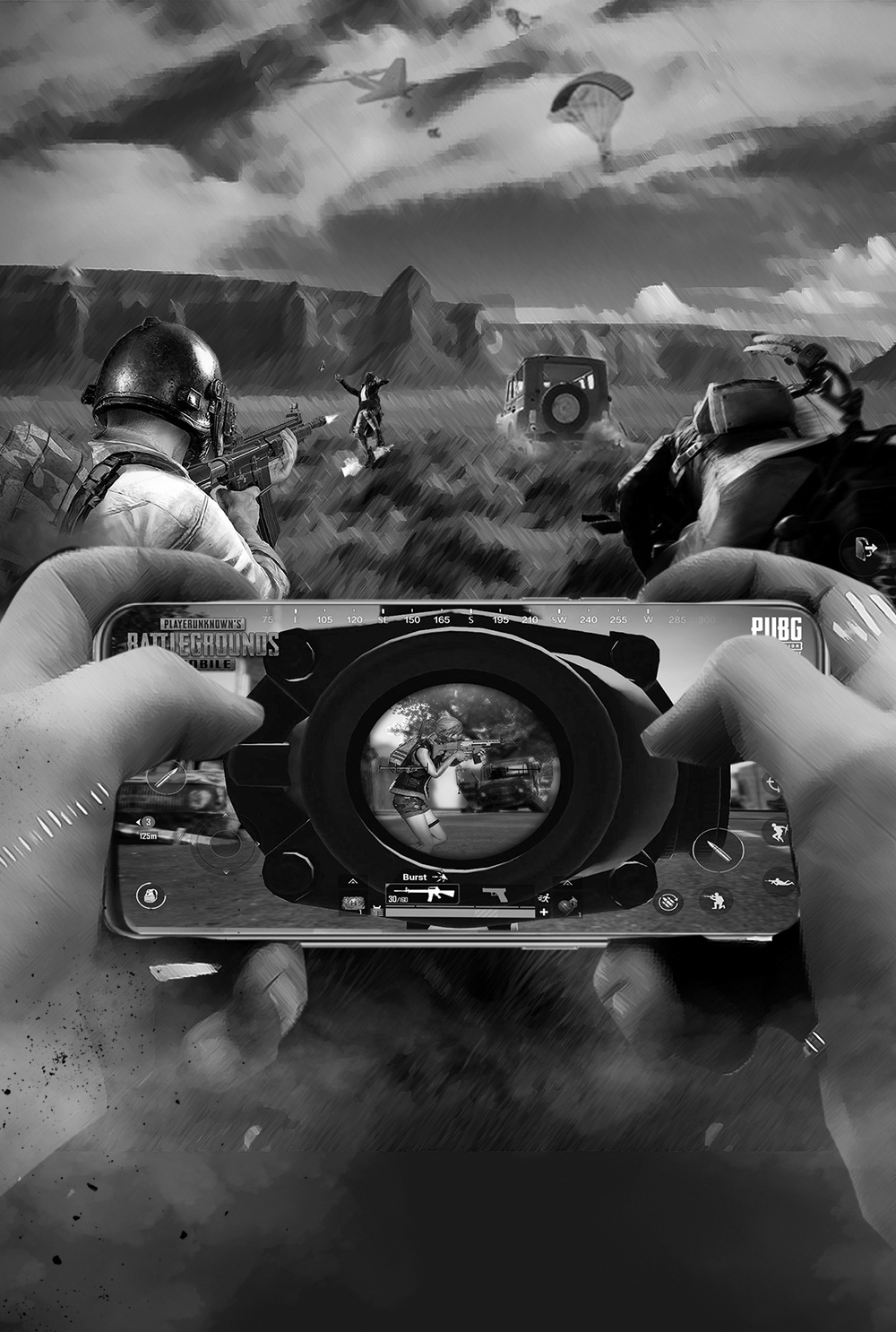
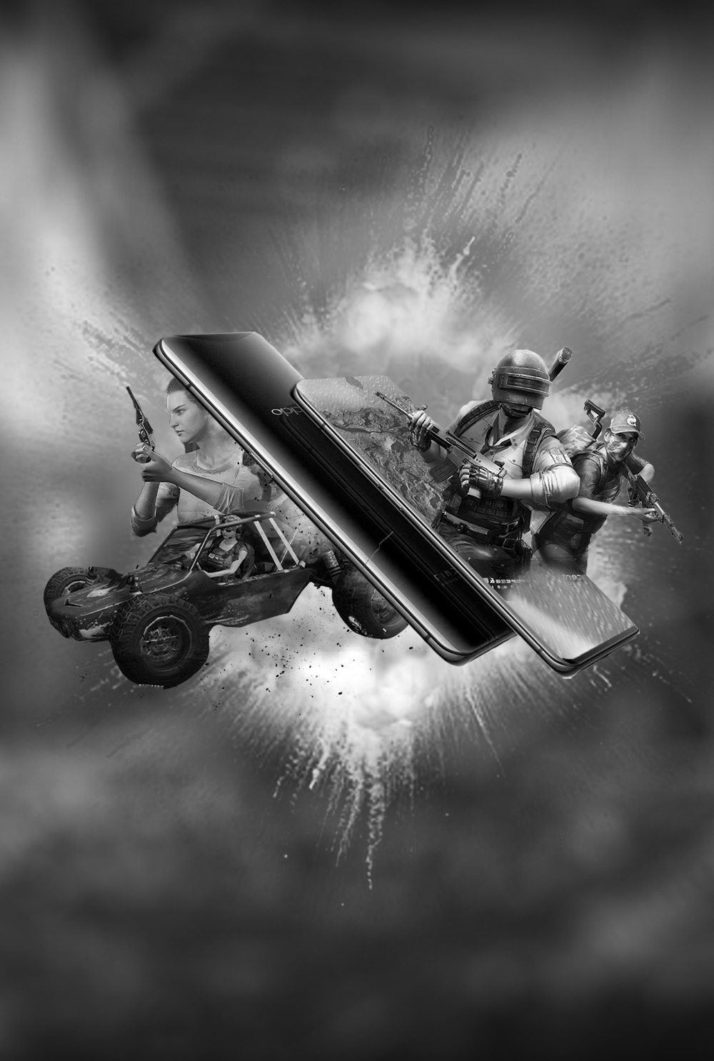
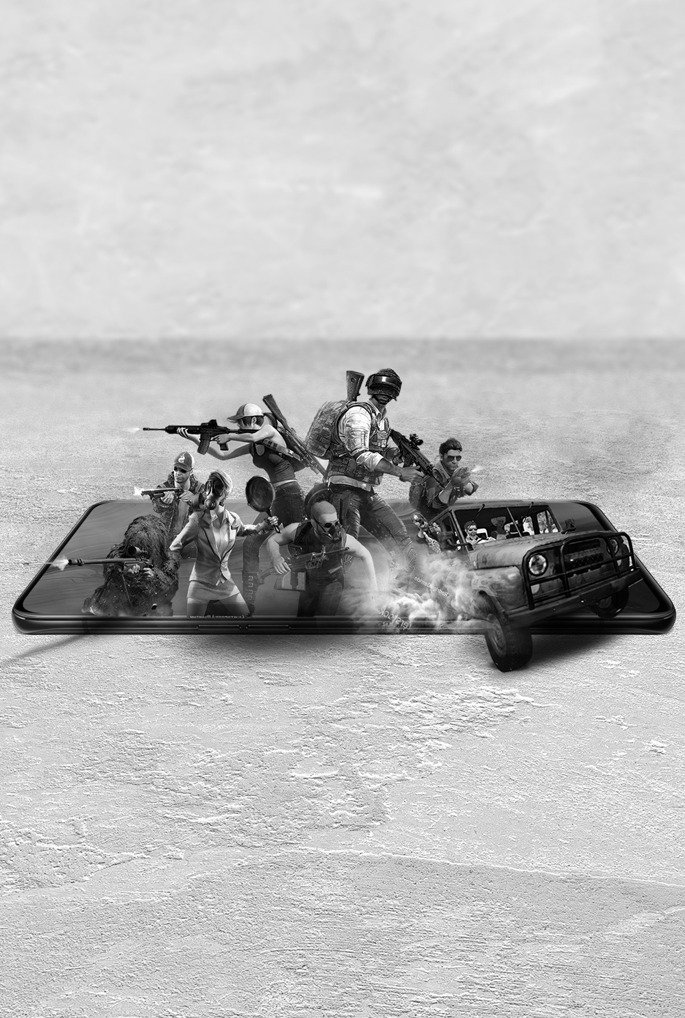
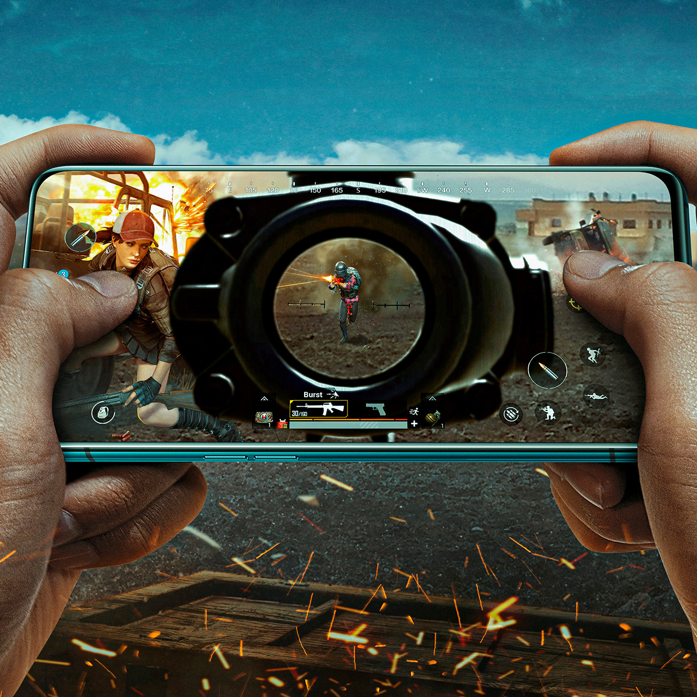
• Reno:
For Reno, we decided to put the player INSIDE the game, as one of the 100 players looking to win the match and take the chicken dinner home. So the idea was to place the player INTO the key art, as the one holding the smartphone and using it as a weapon to get to the top of the ranks.
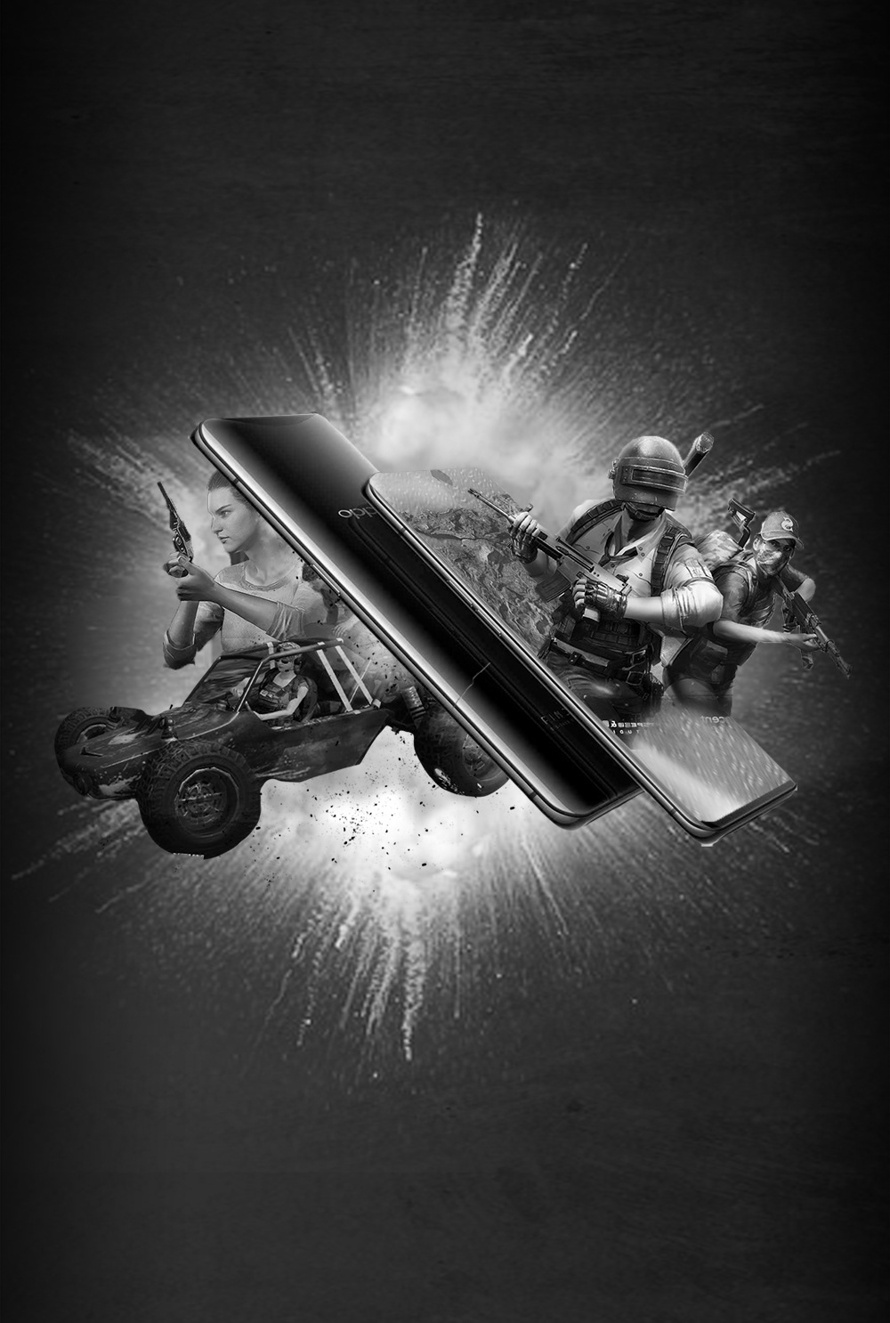
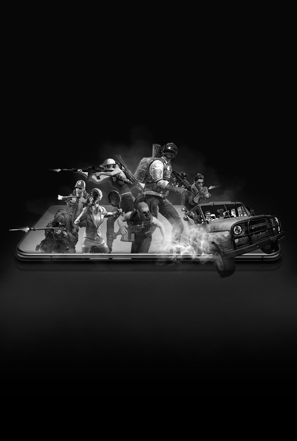
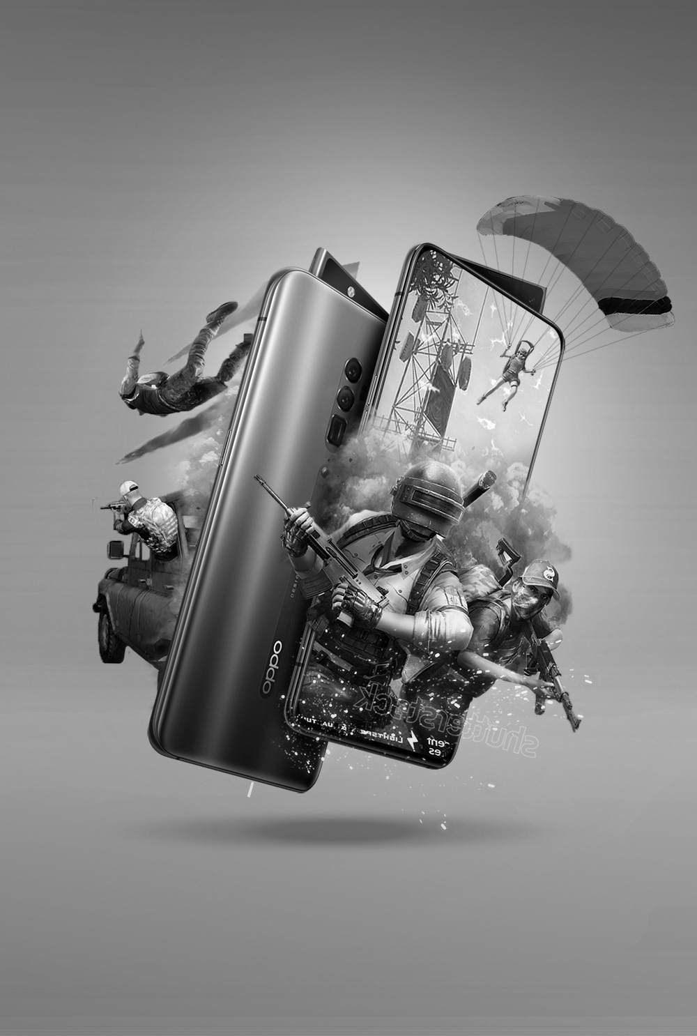
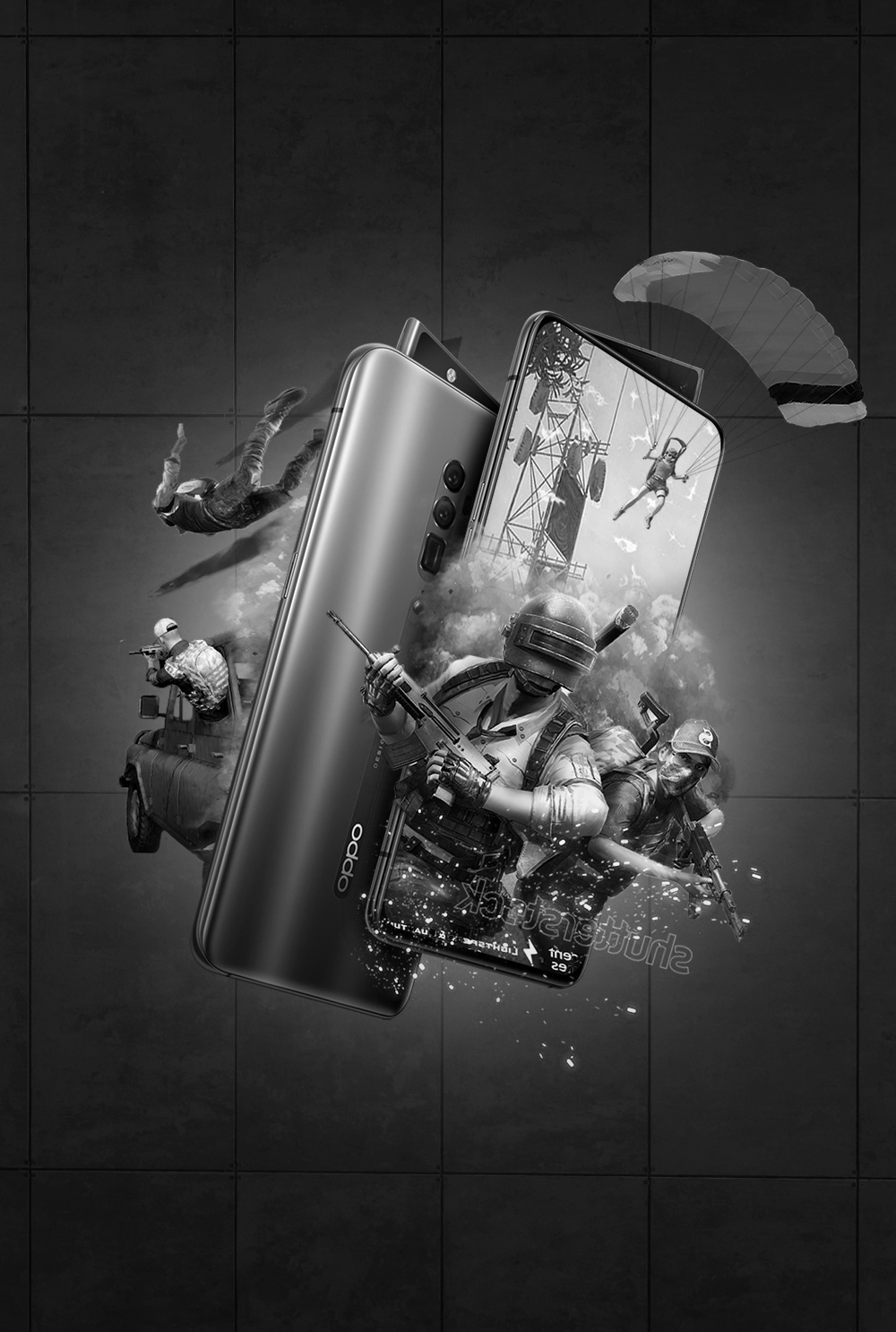
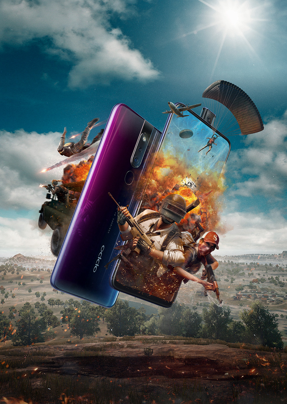
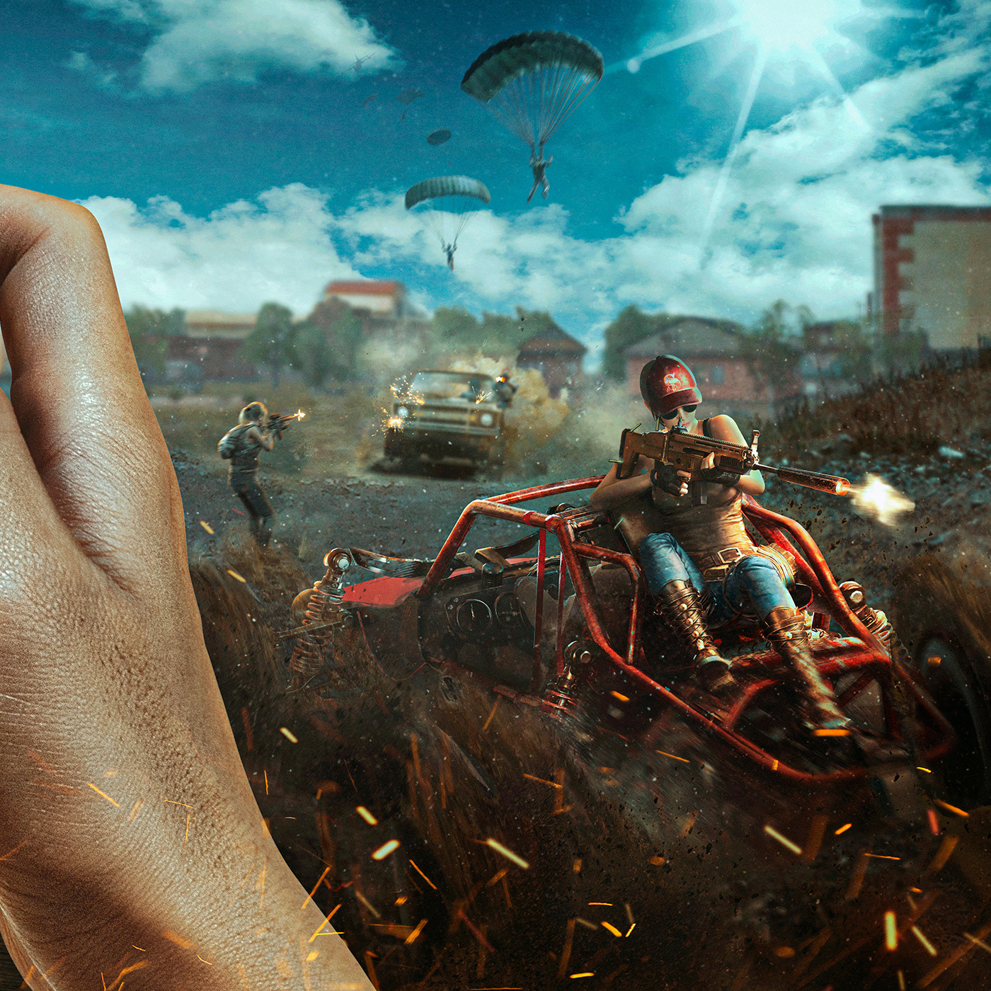
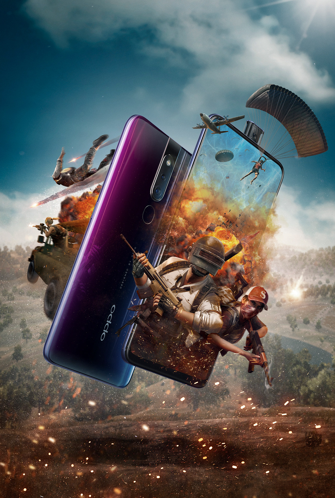
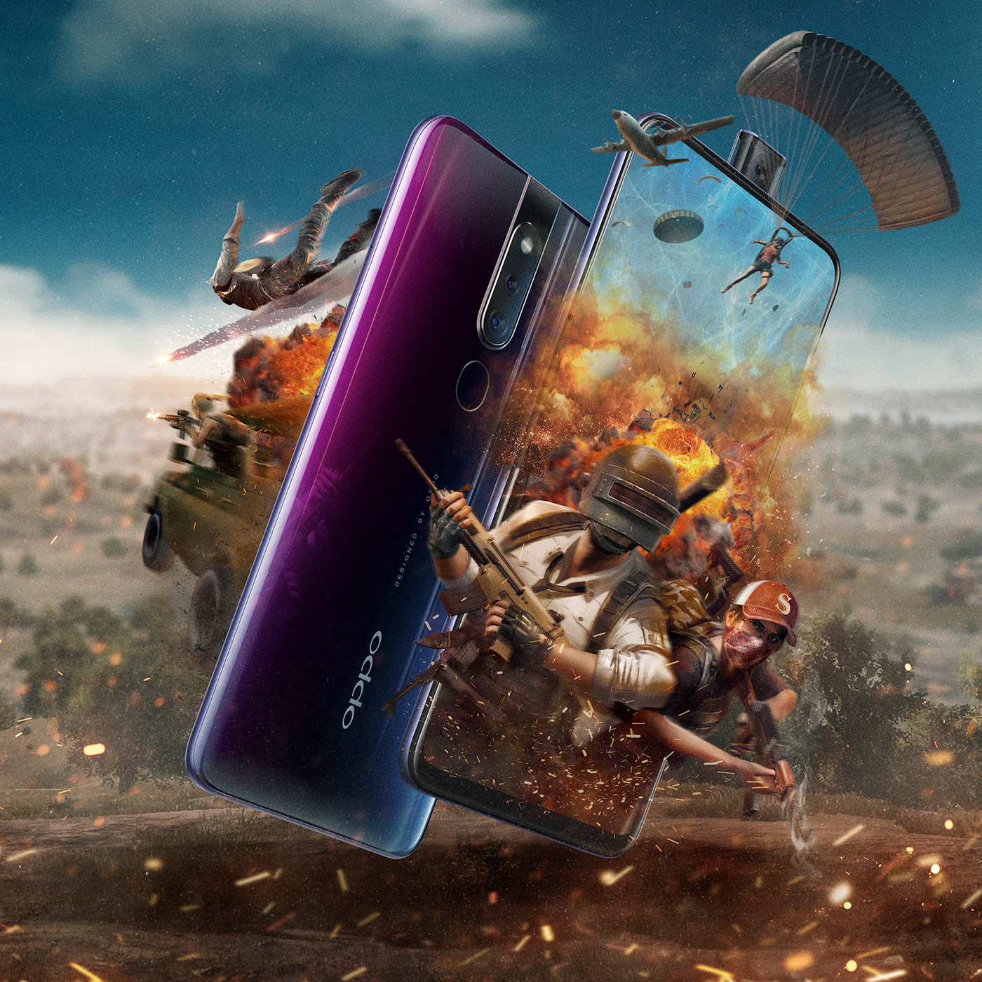
• F11 Pro:
For F11 Pro, we wanted to feature both sides of the smartphone, as if the action is emerging from it, while being a part of the game itself. We also wanted to communicate some of the key features of the product, like the pop-up front camera and the glossy back finish with the multi-camera configuration.
— Phase 03: Post Production
Finally, both images went through our intense post-production phase. Here, we enhanced textures from the game assets, added special FX, atmospherics, DOF effects, and color correction of both images so they fit perfectly as complementary parts of a single campaign.
Reno Final Key Art
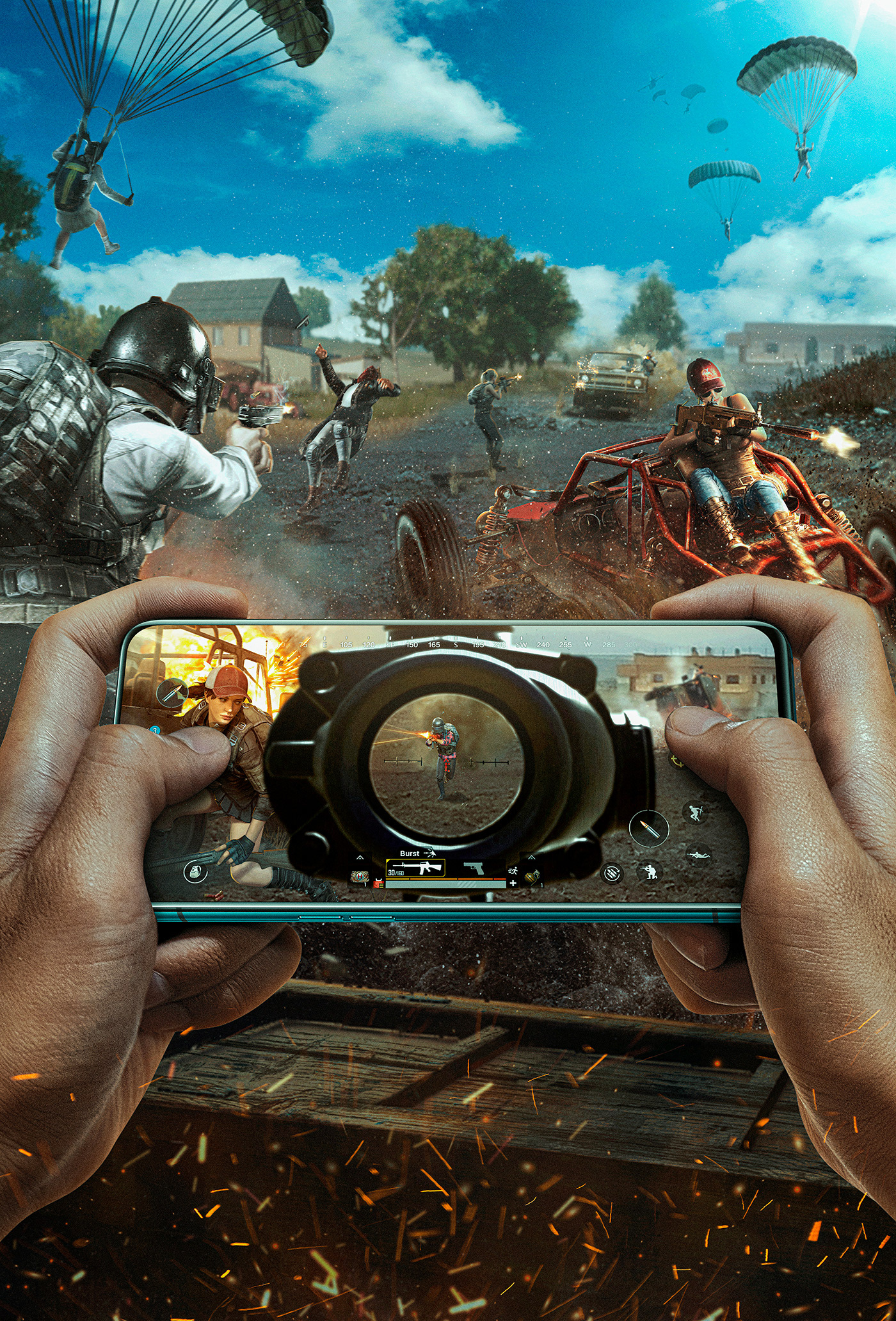
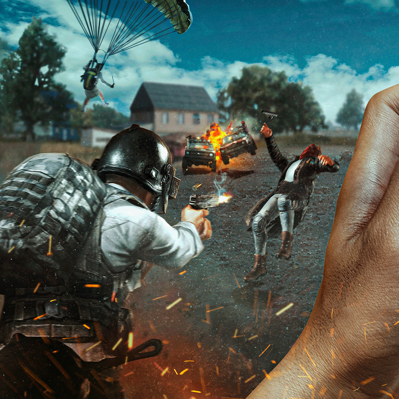
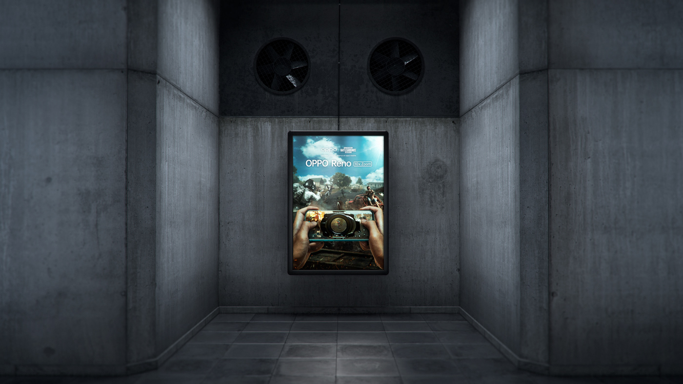
Final ad
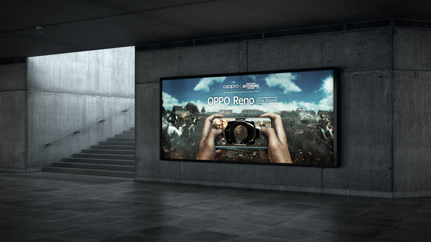
Final ad
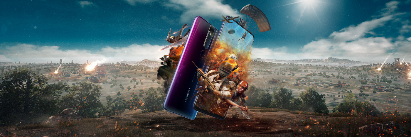
F11 Pro: Final Key Art
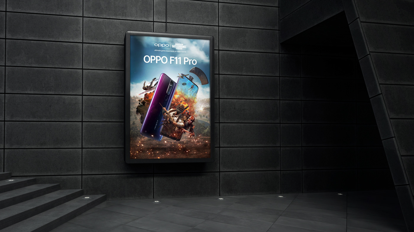
Final ad
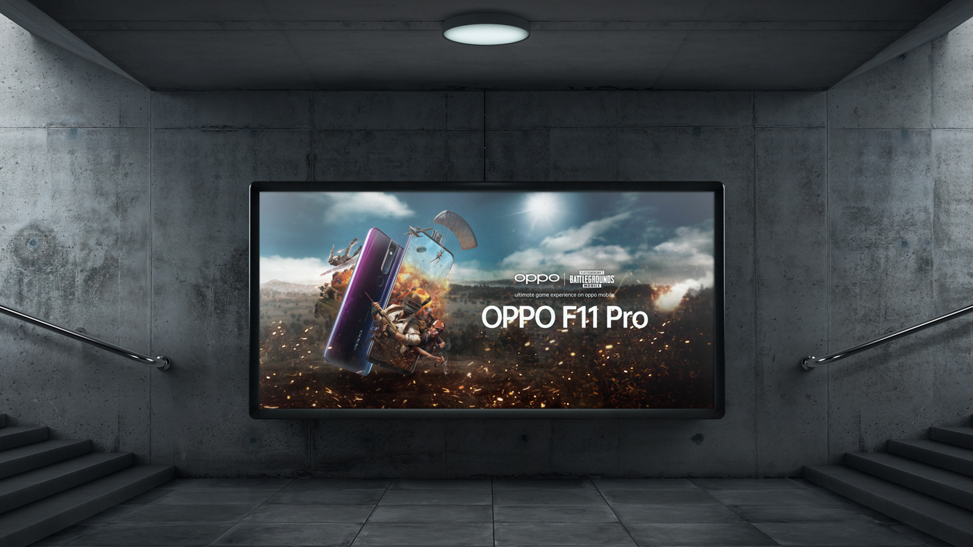
Final ad
PROJECT TITLE
OPPO X PUBG: Reno & F11 Key Art
CLIENT
OPPO
ROLES
DAVE COX - Creative Director & Client Management
MARCE MOYA OCHOA - Lead Project Designer, Art Direction, Concept Sketches, Compositing, Retouching
MARCE MOYA OCHOA - Lead Project Designer, Art Direction, Concept Sketches, Compositing, Retouching