
Here comes a new challenger!
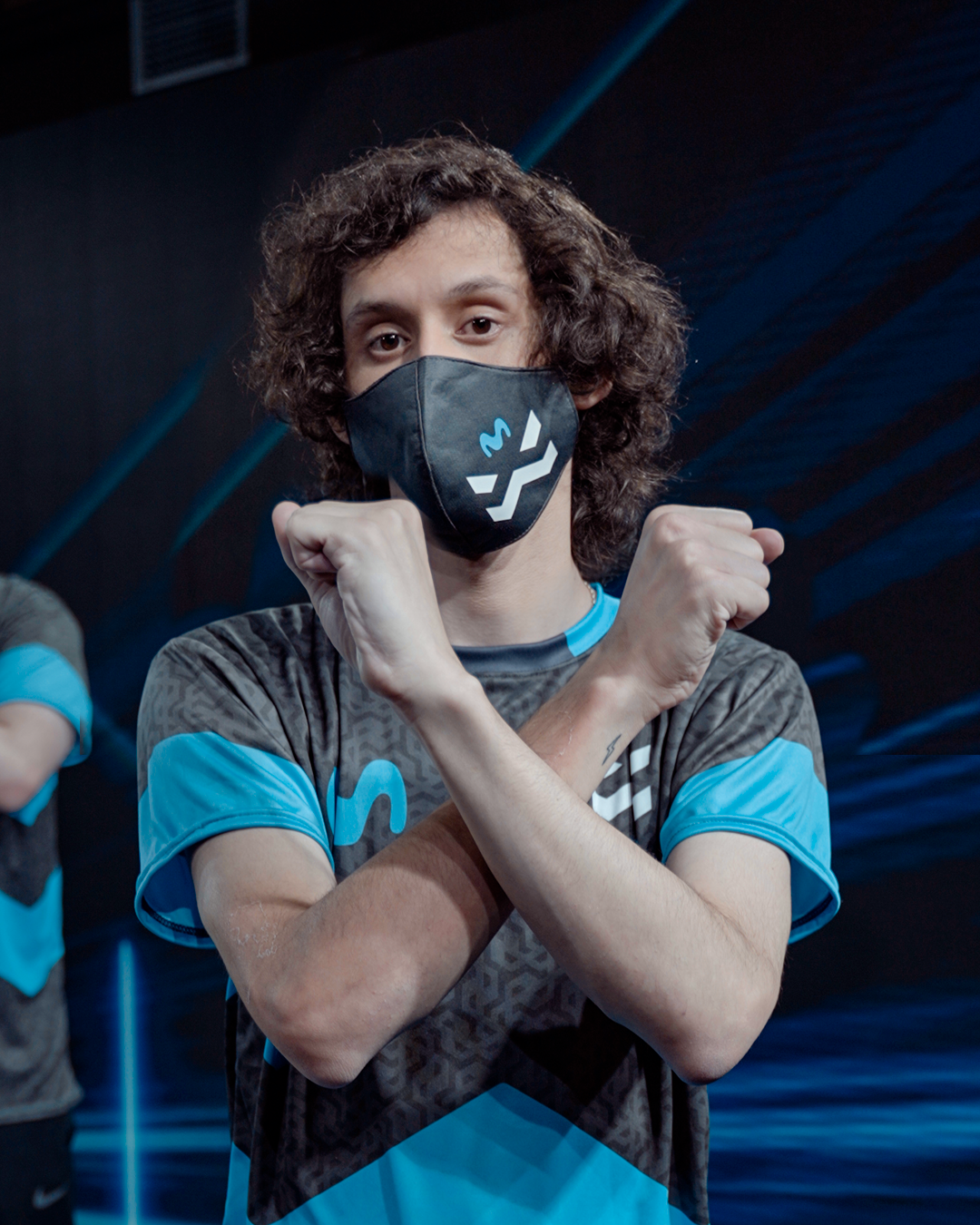
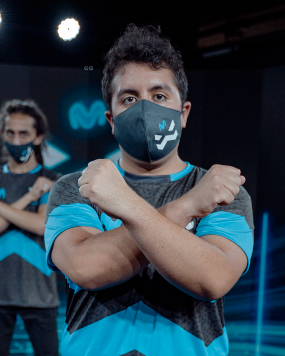
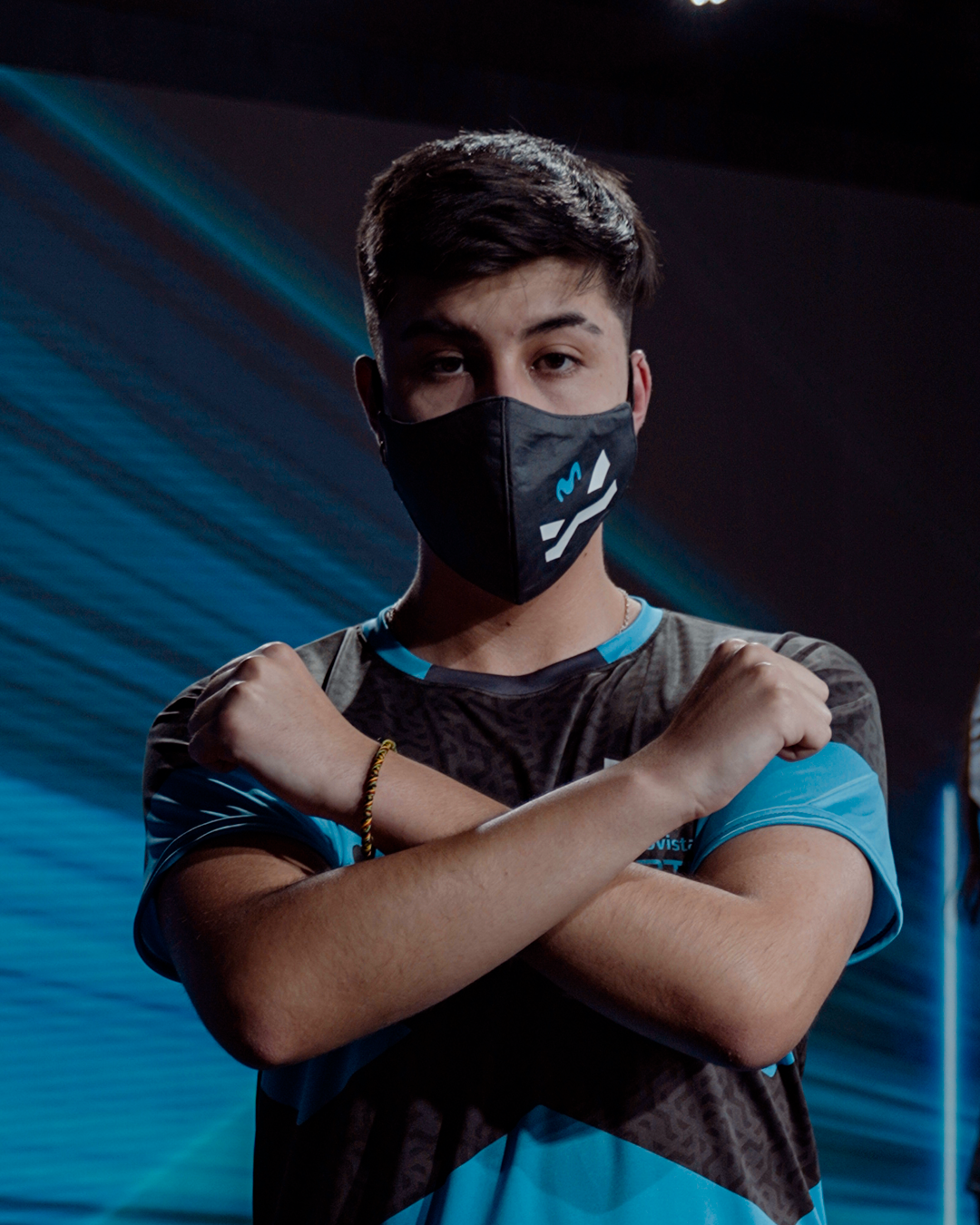
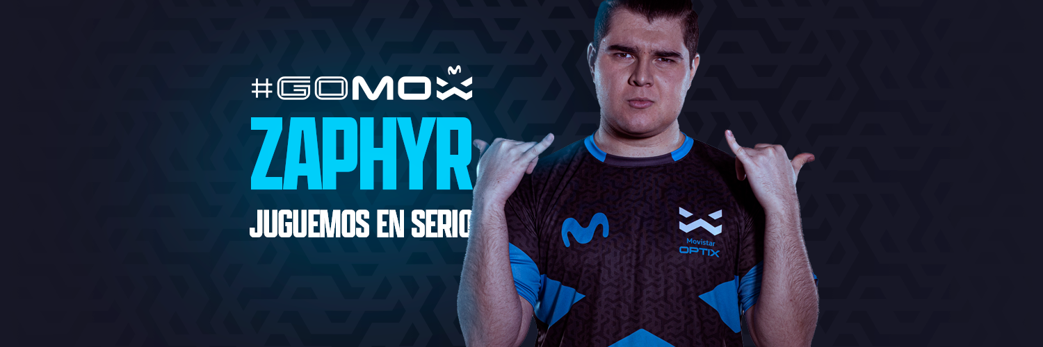
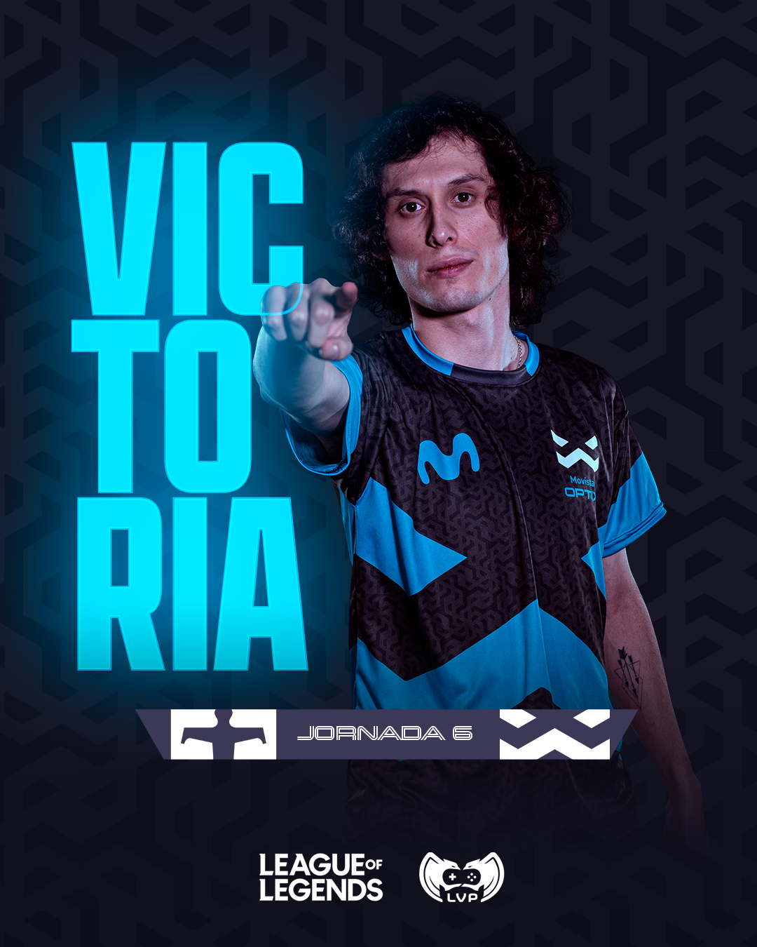
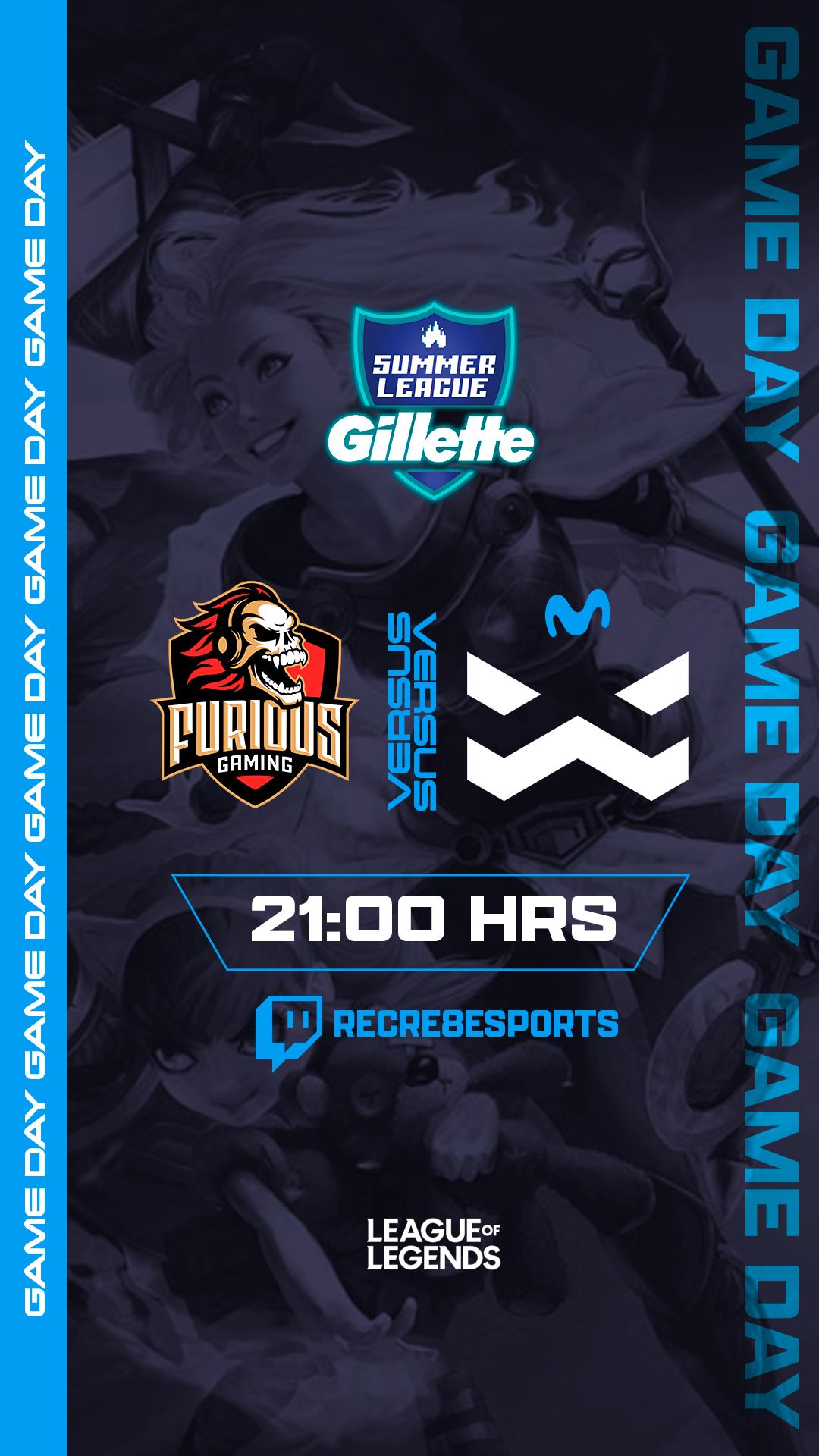
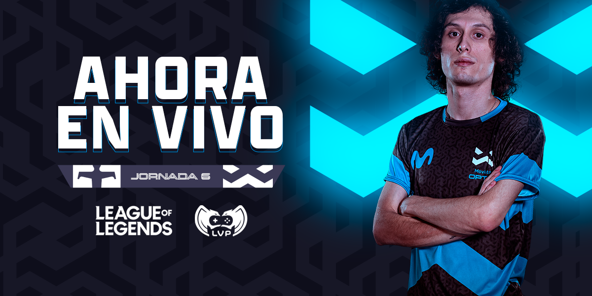
Movistar Optix: Esports Club
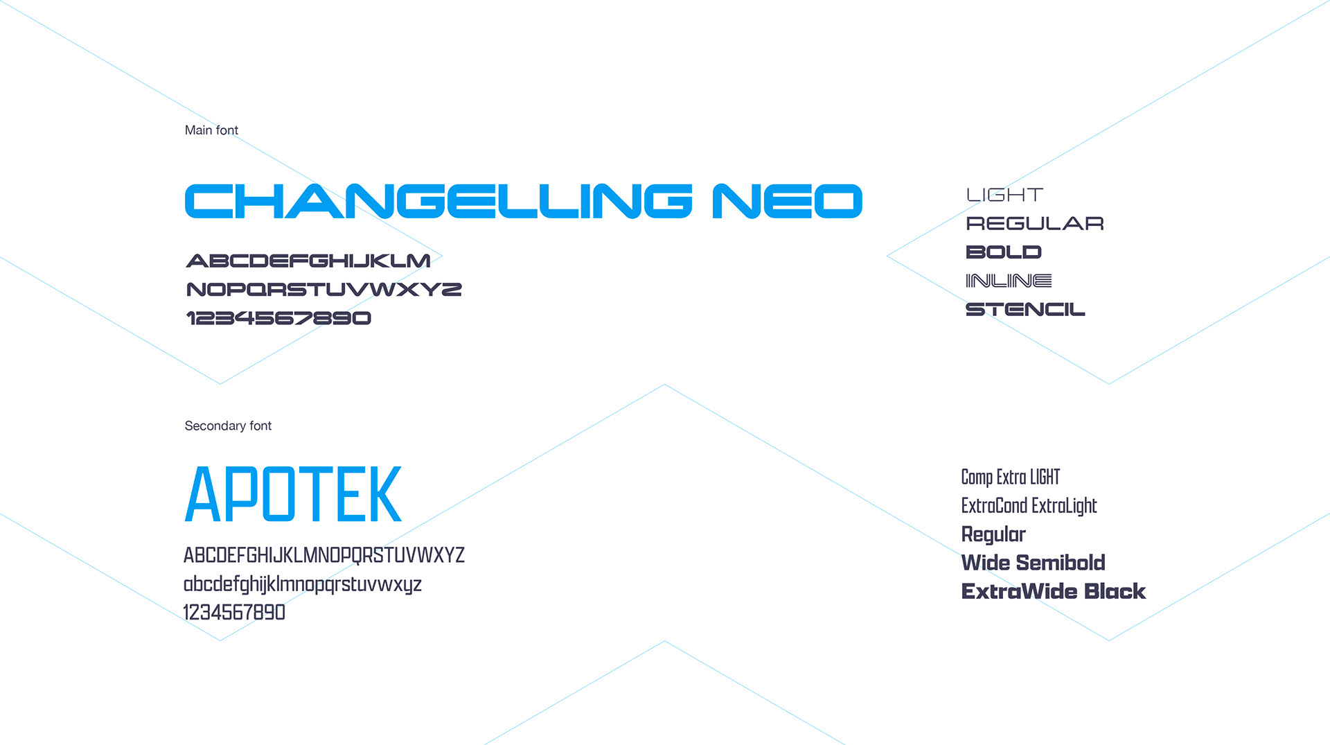
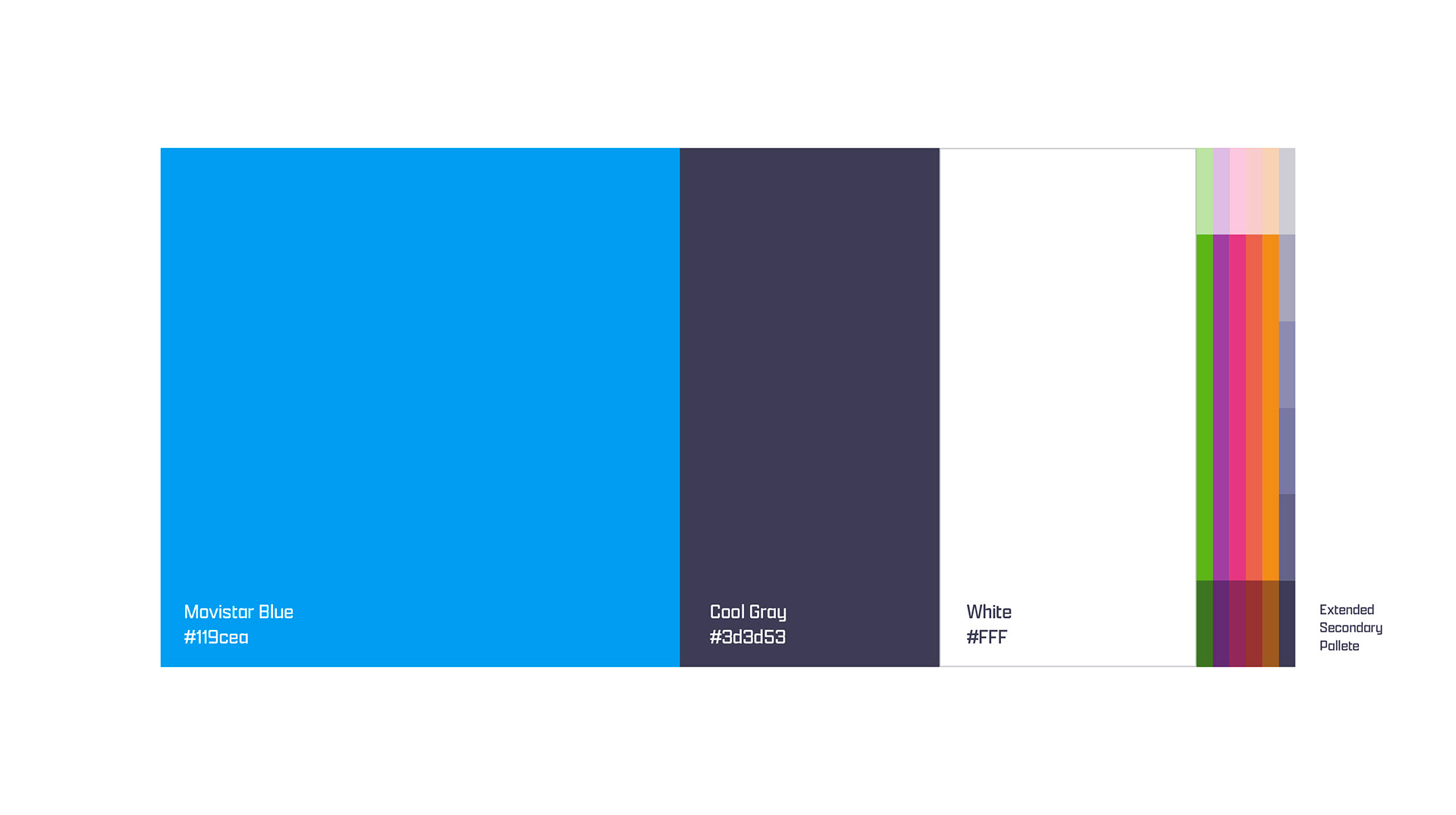
Visual ID
The brief:
Movistar Optix (MOX, for friends) is the newest esports club in Chile. Backed up by telco Movistar, GameClub and Intel, MOX aims to become the most dominant team in the country, and soon the region.
We were tasked to create the complete visual ID of the team, including ideation of the name, branding and values.
The rational:
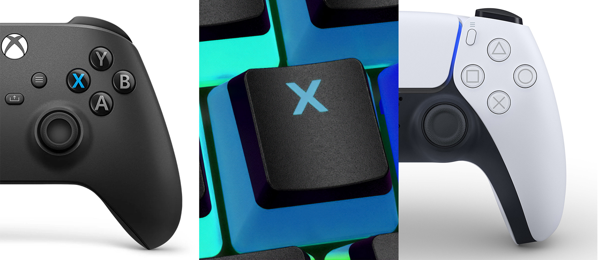
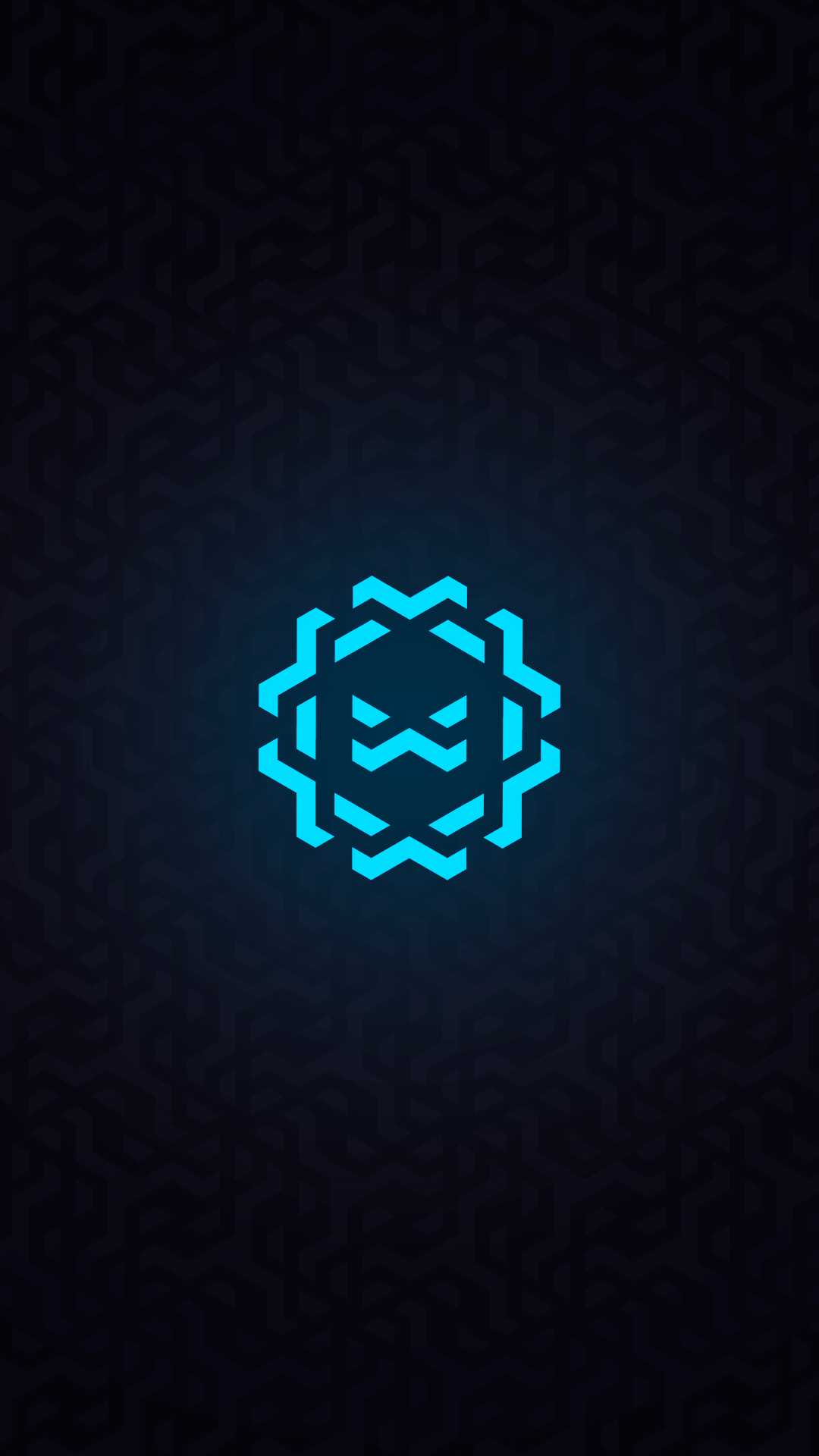
The name is a word play on optic fiber, one of Movistar's top benefits for gamers, who really need high speed internet connections to perform at a pro level, and also a celebration of the letter X, that symbolizes the unknown, the search and the focus, but also, is present in all input peripherals, such as controllers and gaming keybords.
The approach:
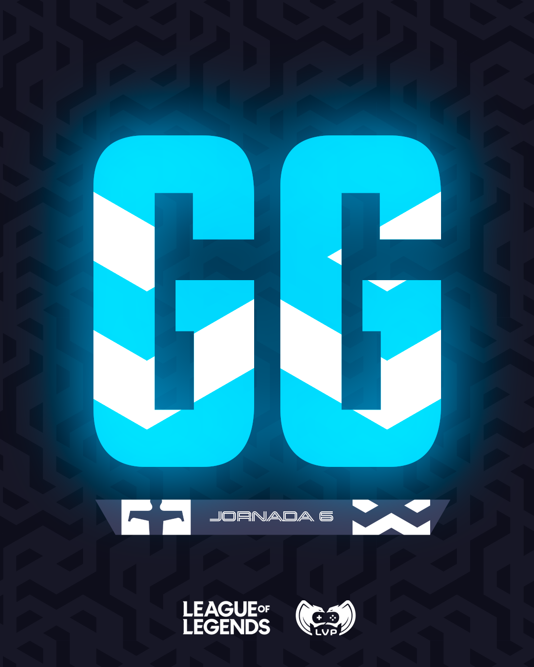
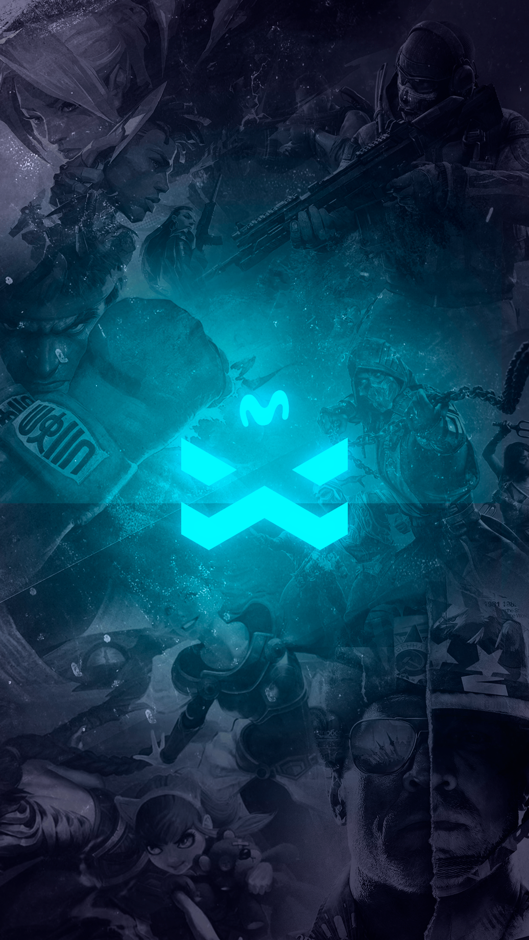
We needed a logo that resembled the look and feel of a well established international esport team, like Fnatic, FazeClan or TSM.
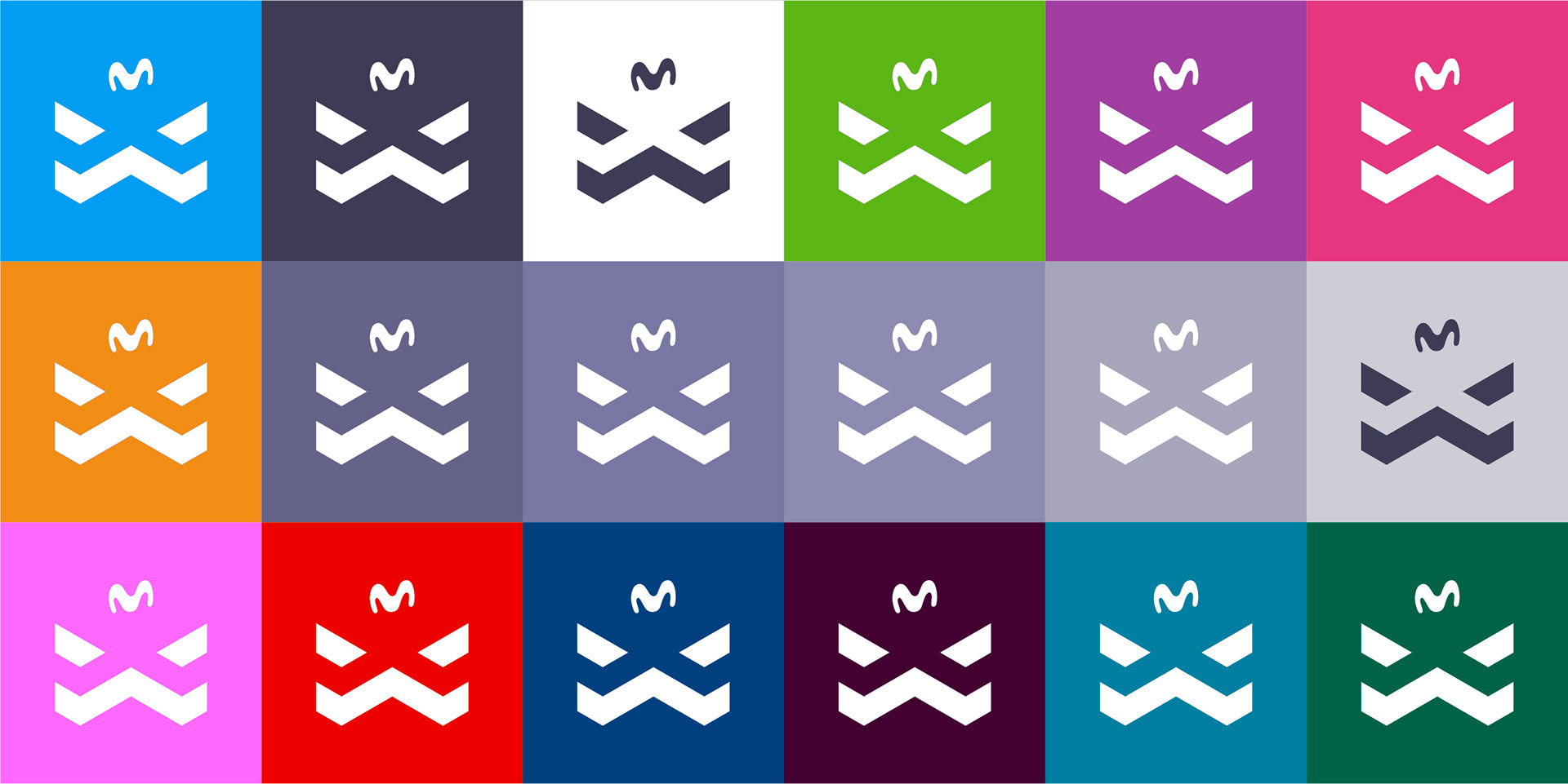
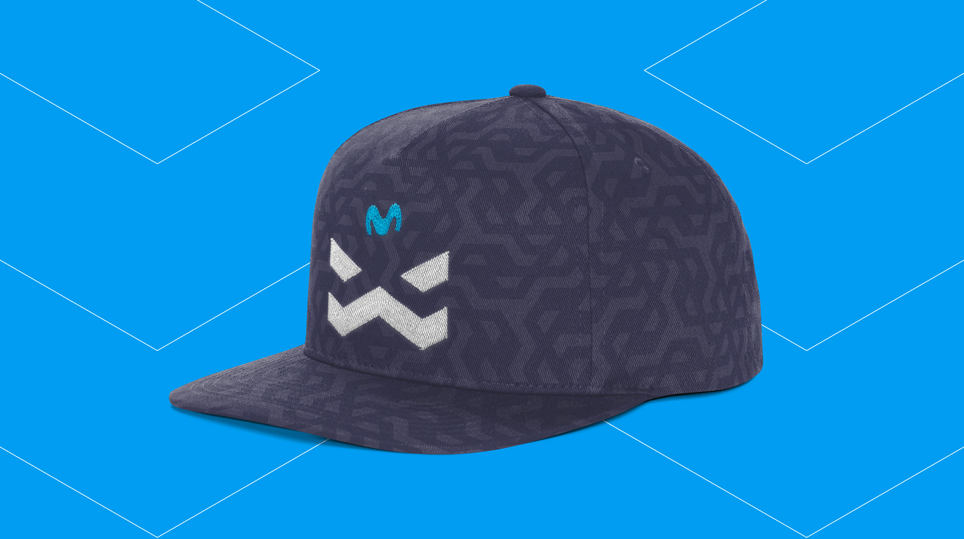
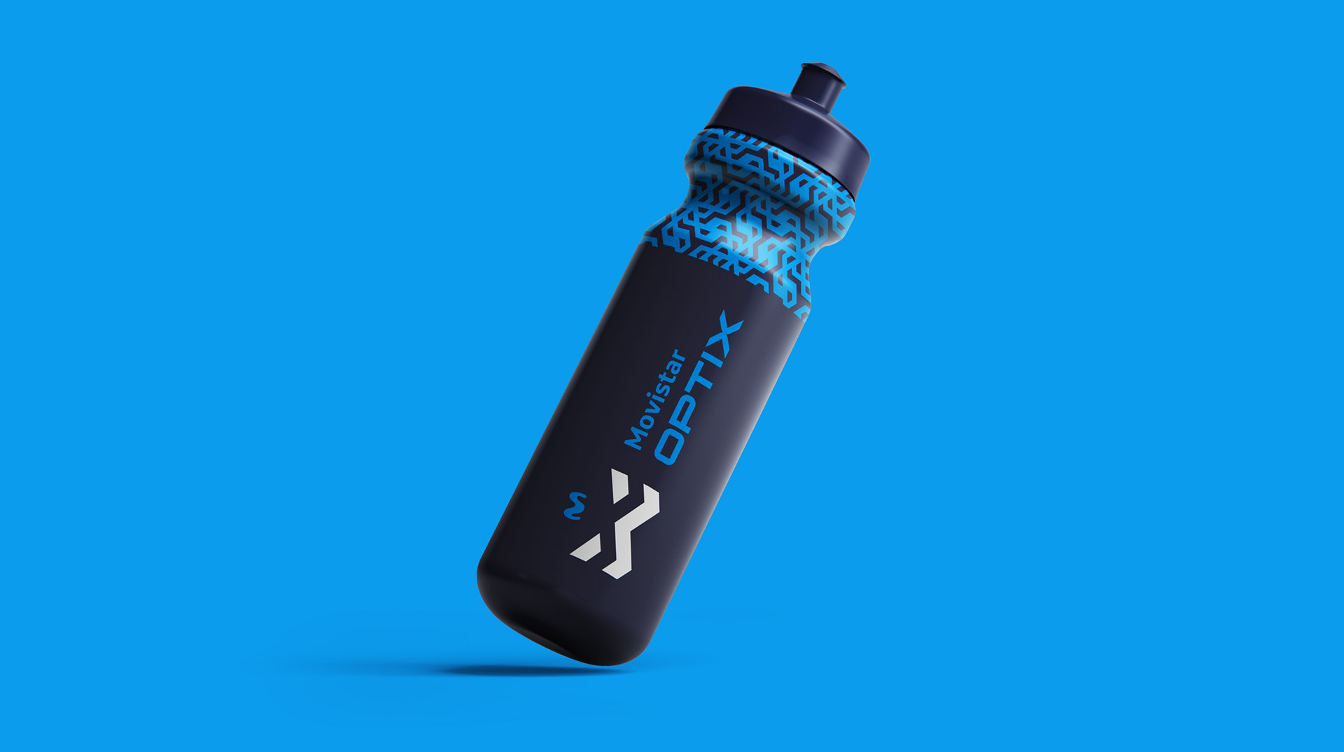
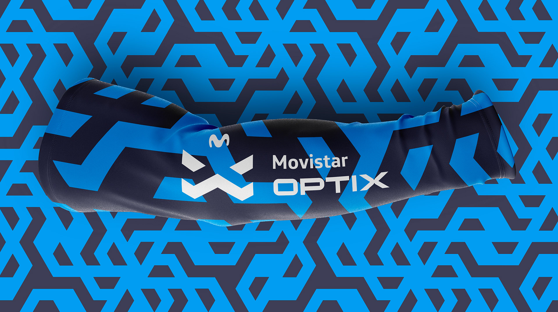
We took a very playful and geometric approach to the branding project, developing a triangular grid with the 3 fundamental pillars of the team: technology, professionalism and wittiness.
The result:
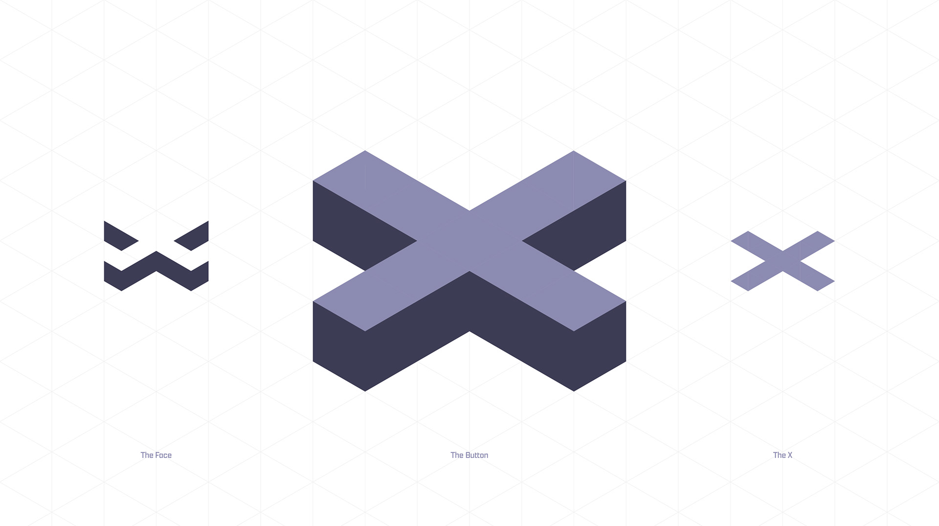
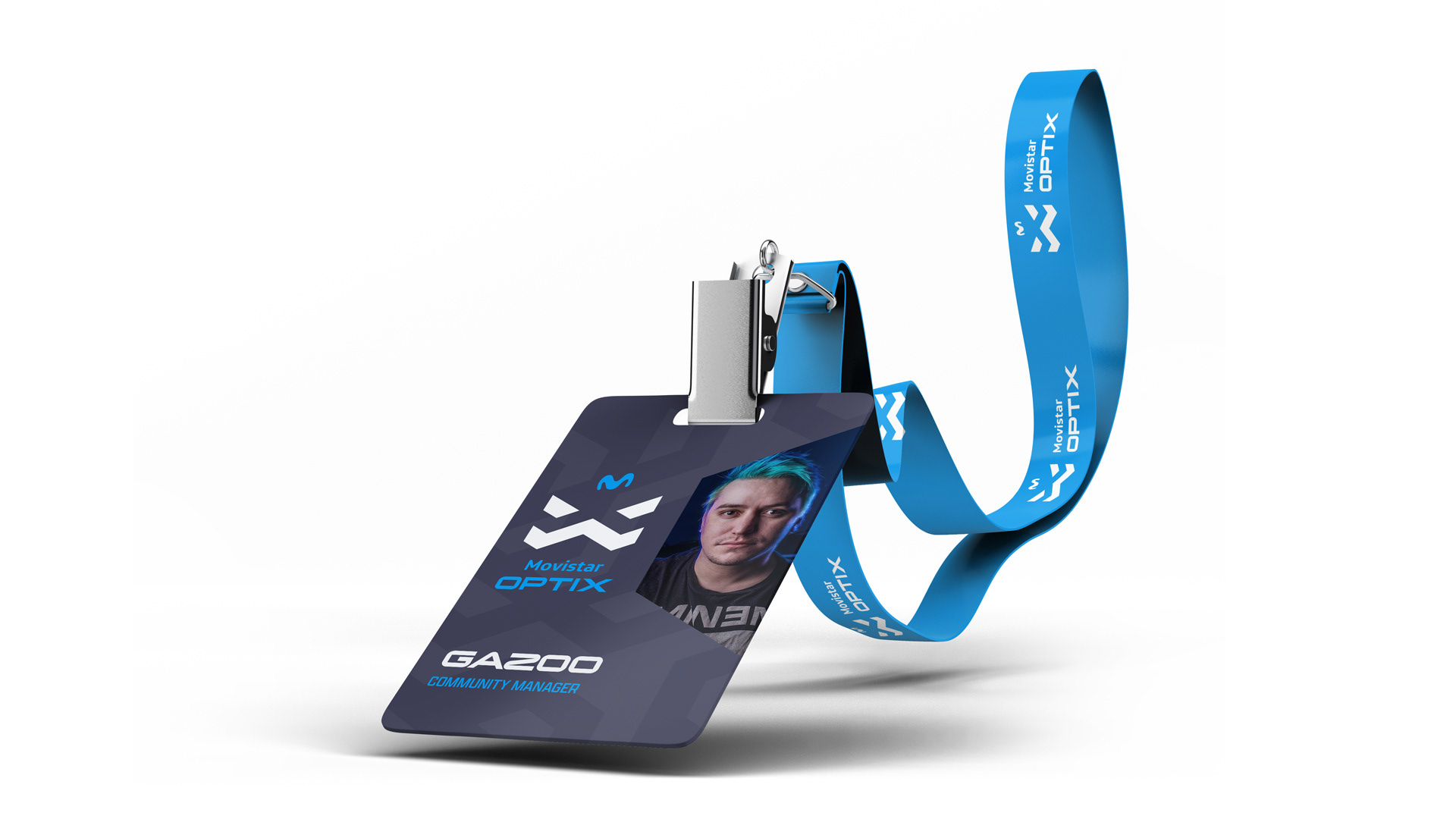
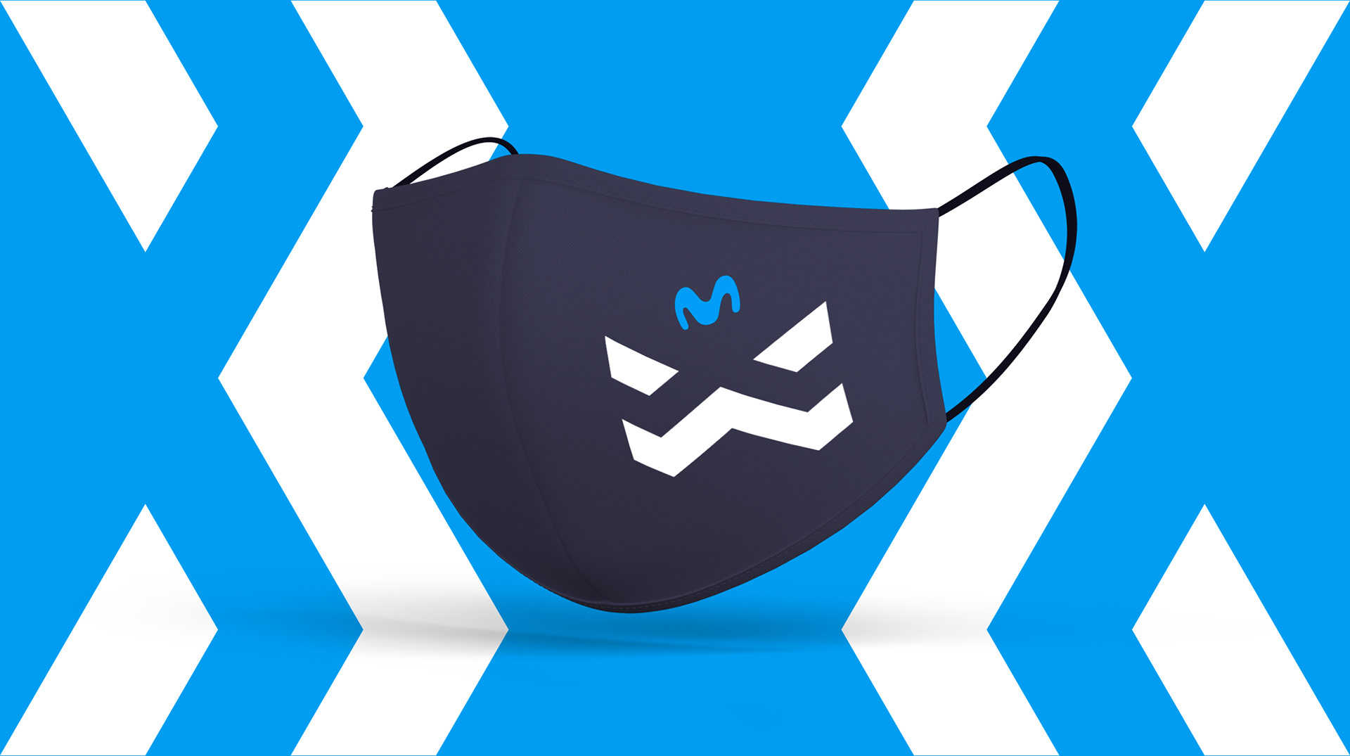
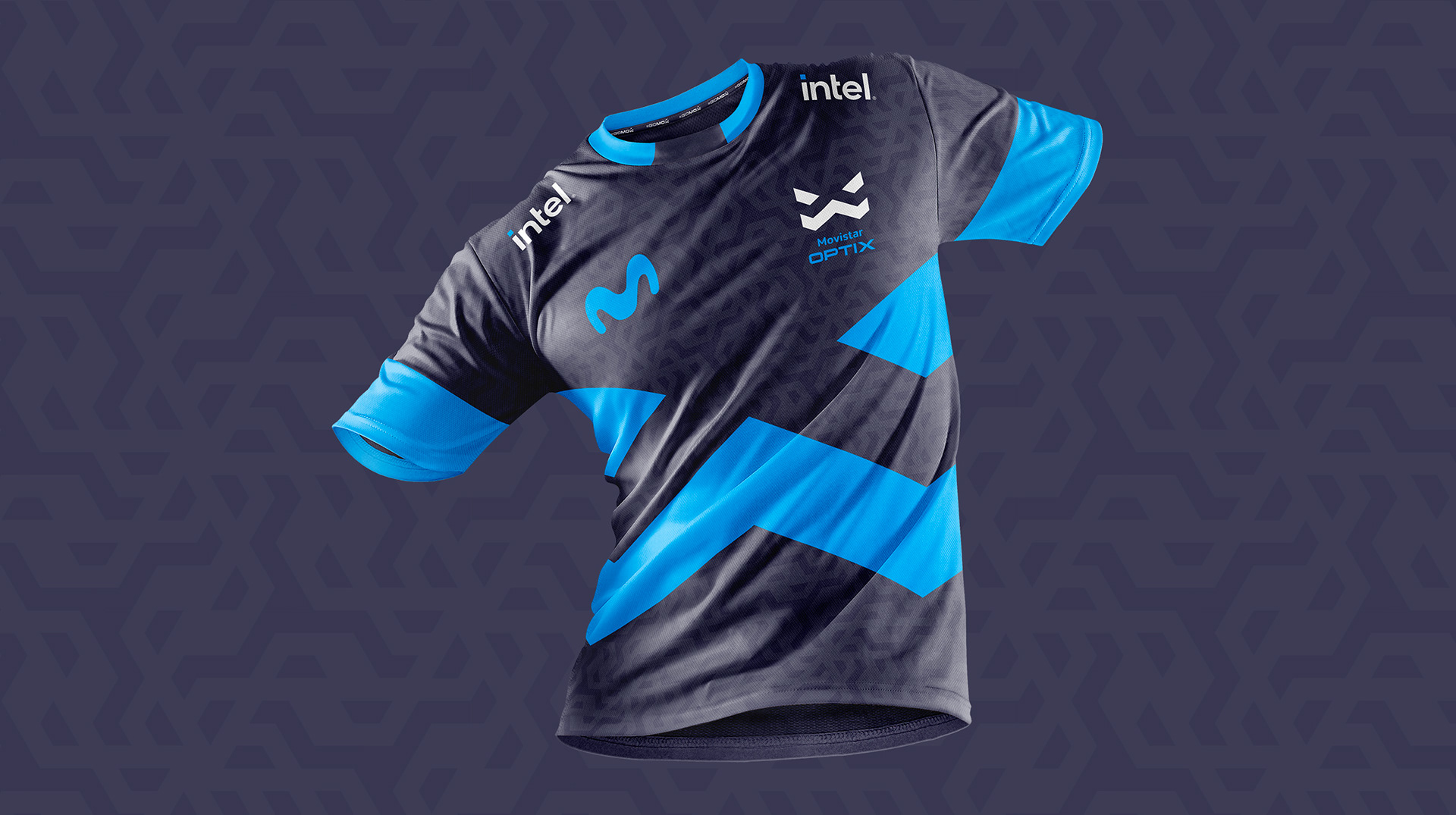
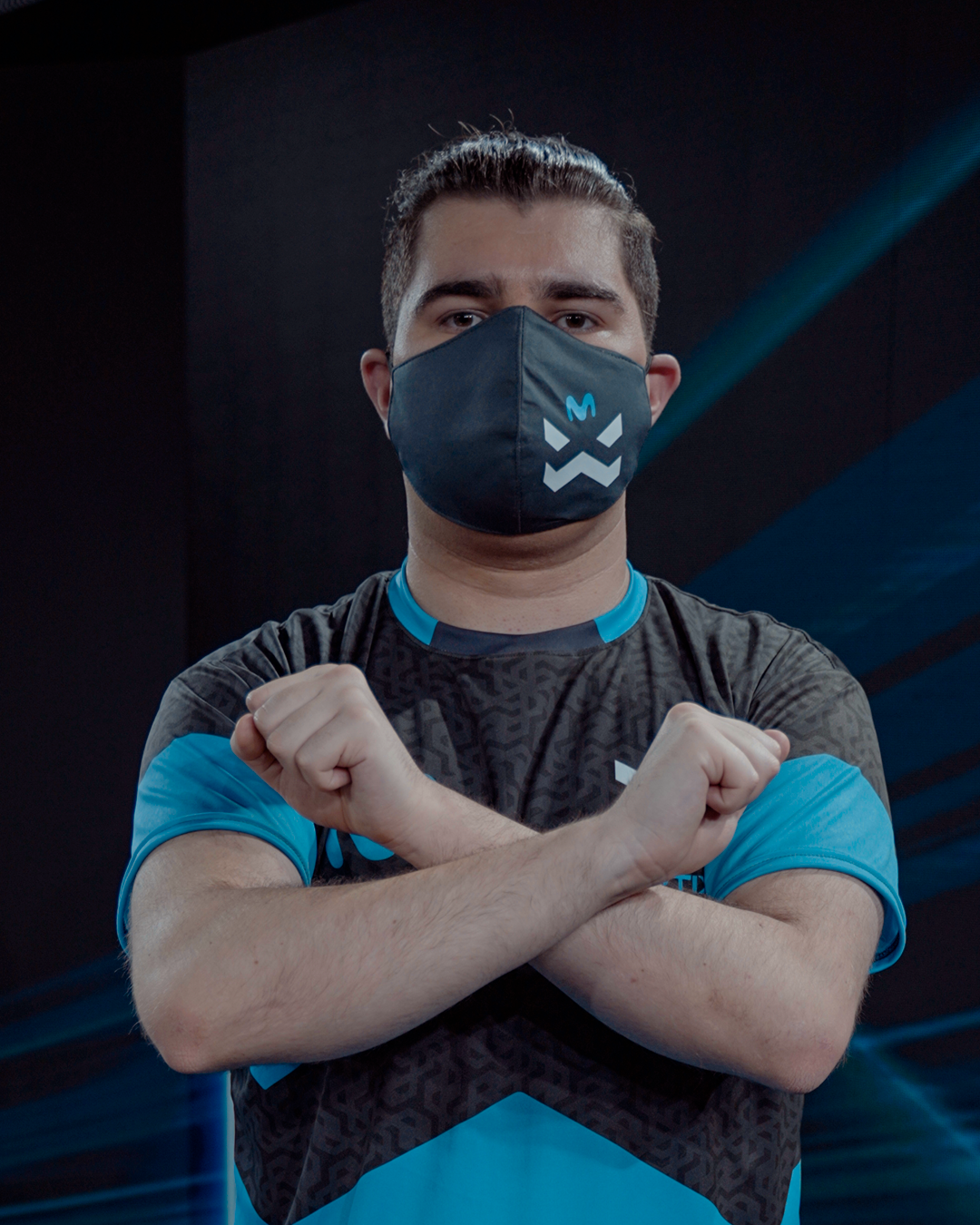
We discovered that the logo itself, can be playable too! Using an optical illusion within the negative space, a face appeared, that carried a lot of the personality we were looking for. But also, in the positive space, the X from the controllers emerged, and in the mix between both, a button came alive!
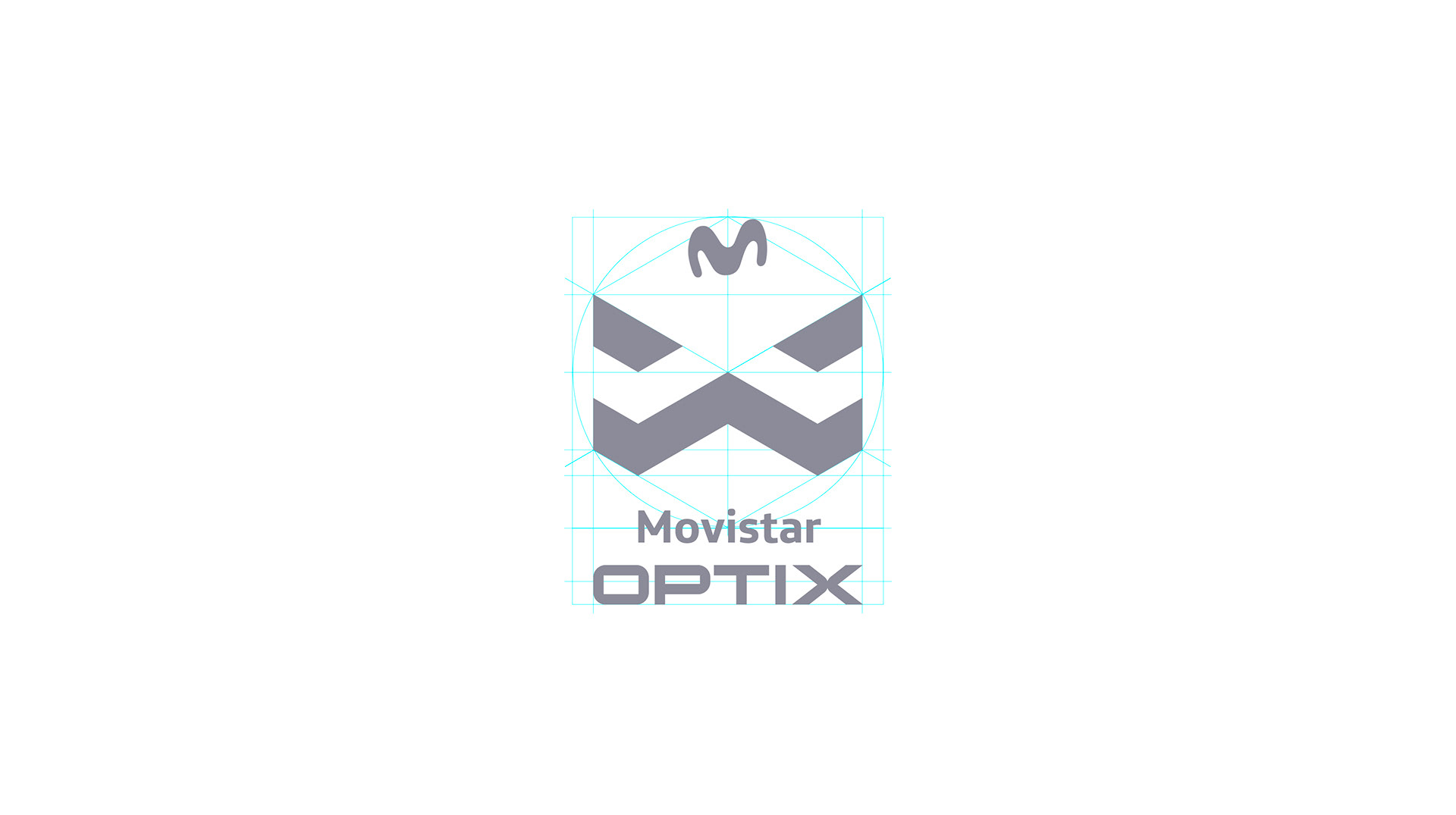
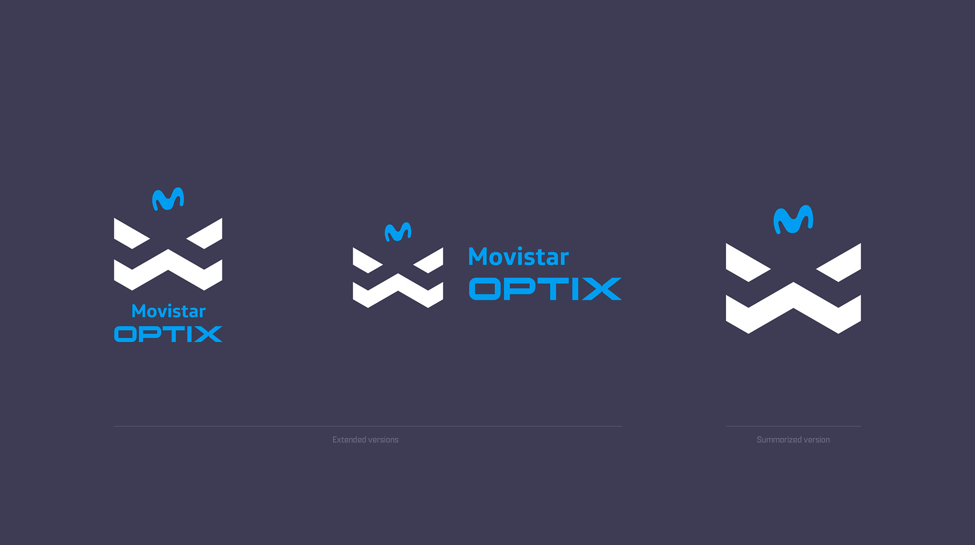
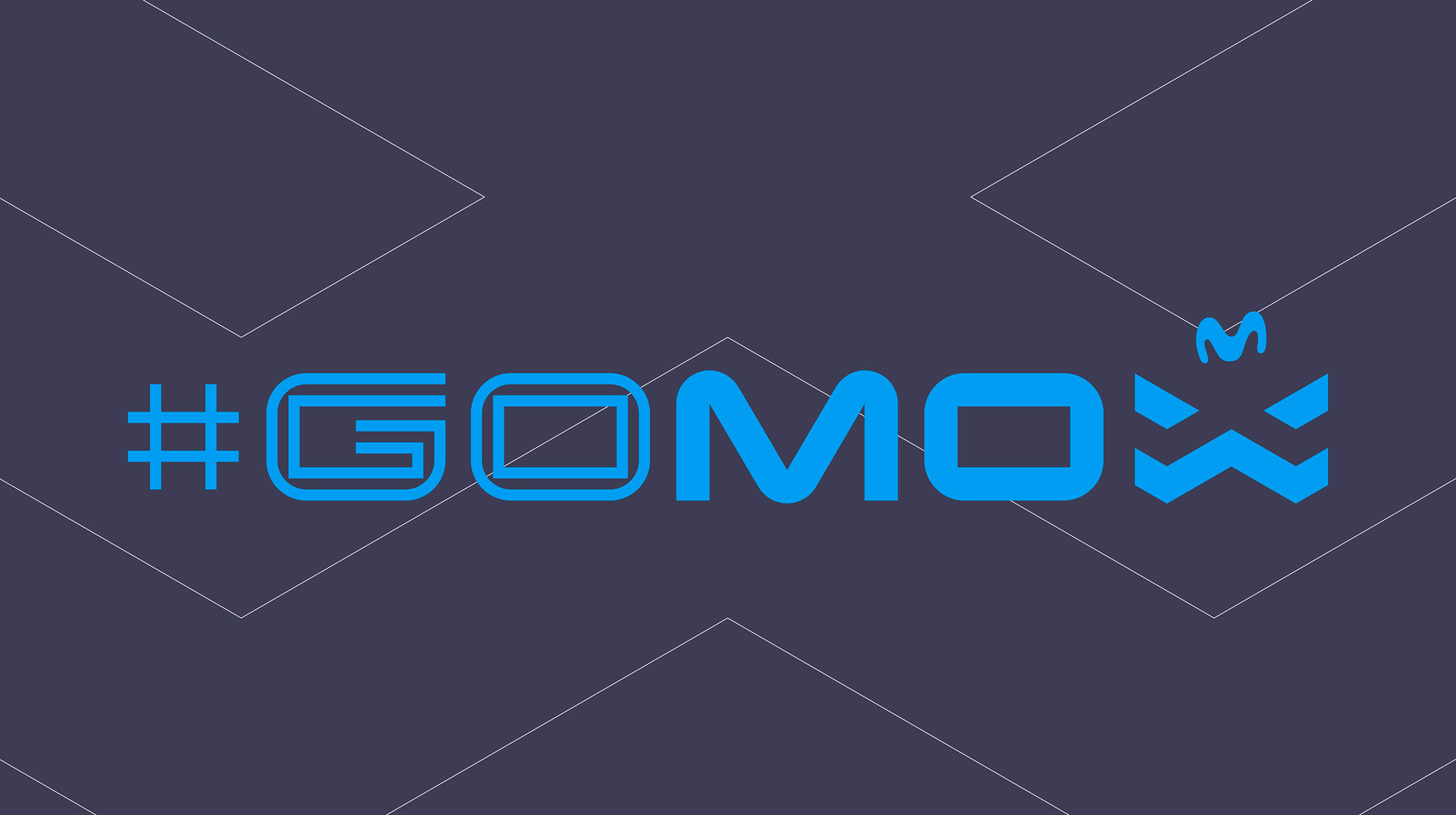
Then, it was time to find the main sponsor a position in the icon, and the logo was born.


Credits
Client: Movistar + GameClub
Lead creative & head of art: Marce Moya Ochoa
Art director, motion graphics: David Quiroz
Video edit, photography: Claudio Ramírez
Head of content: Mario Vigorena
Community Manager: Benjamín Ovalle
Sound designer: Luis Puccio
Filmed at Río Negro Studio
